Wallpapers

Charts of real data, drawn to sit behind your windows.

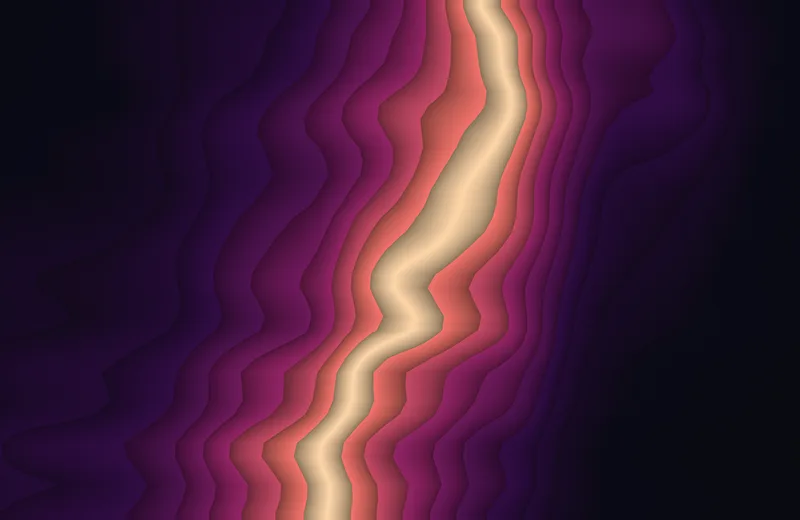
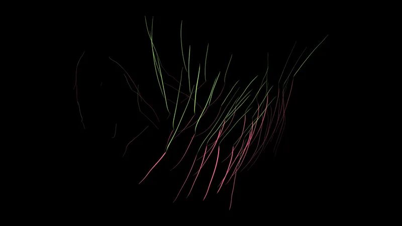
There are 151 wallpapers here. Each one is a picture of some data: the sun over New York, a morning of subway trains, the Gulf Stream, a stork flying to Africa. A few at the end are plain mathematics. Under each one is a note on what you are looking at and where the numbers came from.

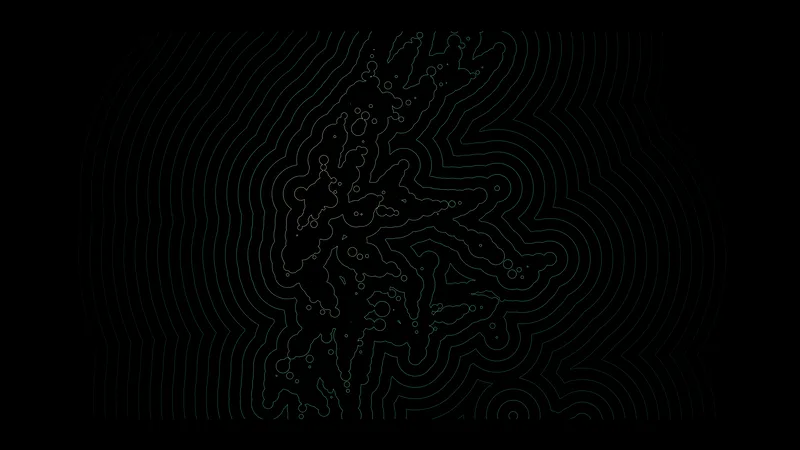
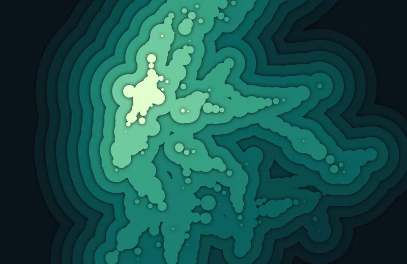
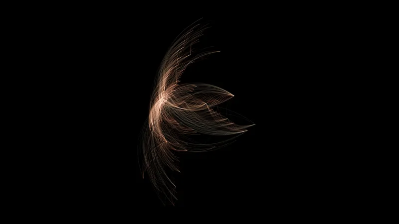
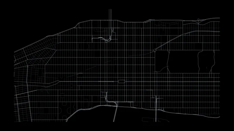
They come in two kinds, because two kinds of screen want opposite things. OLED screens turn each pixel off for black, so those wallpapers are thin lines and small points on pure black, and nine tenths of the screen stays dark. Mini-LED screens, like a MacBook Pro, light the panel in zones, and a small bright mark on black gets a halo. Those wallpapers fill the screen with large bands of color instead, in Display P3. When the same data has both, the two versions sit next to each other.

Mobile is 1320 × 2868 and keeps the clock and the dock clear. Desktop is 3840 × 2160 for the OLED set and 3024 × 1964 for the mini-LED set. The captioned desktop files have one line in the bottom left corner that says what the chart is. Every download is the full-size PNG.

New York: sun, heat, and tide

The first data set I tried was the sun over New York. The year runs across the image and the day runs down it, or each day gets its own line.

Sunlight, 2025

Sunlight, 2025

OLED

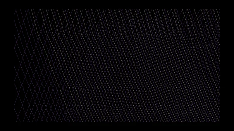
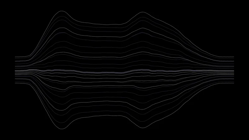
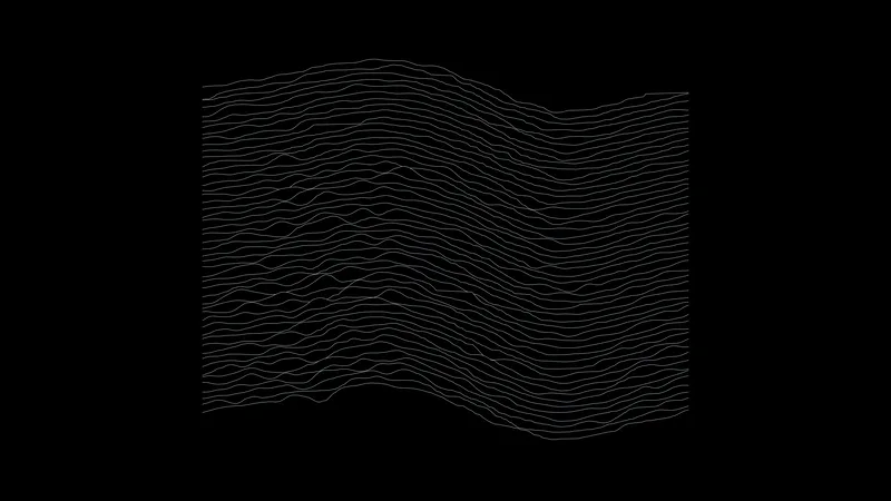
One line for every fifth day of 2025, January at the top. Each line runs from midnight to midnight, and its height is the sunlight reaching level ground: the height of the sun in the sky, cut down by that hour's real cloud cover. Clear days are tall smooth arcs. Overcast days are low and flat. The lines are wider in summer because the days are longer.

Data: Solar geometry (NOAA equations) and hourly cloud cover from the ERA5 reanalysis through the Open-Meteo archive

Download 3840 × 2160 · 0.4 MB
Sunlight, 30-year mean

Sunlight, 30-year mean

OLED

The same chart as Sunlight 2025, but each line uses the cloud cover averaged over the same five days in 1995 to 2024. The weather of single days disappears and the climate is left: a smooth mound, a little lower than a cloudless sky would give.

Data: Solar geometry and 30 years of hourly cloud cover from the ERA5 reanalysis through the Open-Meteo archive

Download 3840 × 2160 · 0.5 MB
Daylight ring

Daylight ring

OLED

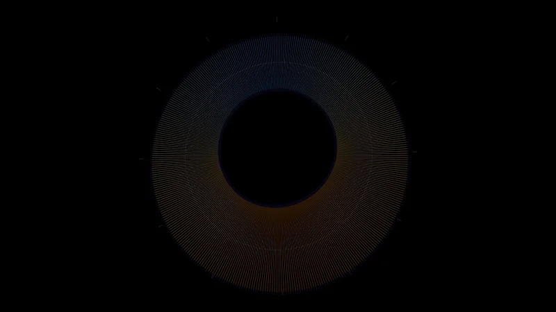
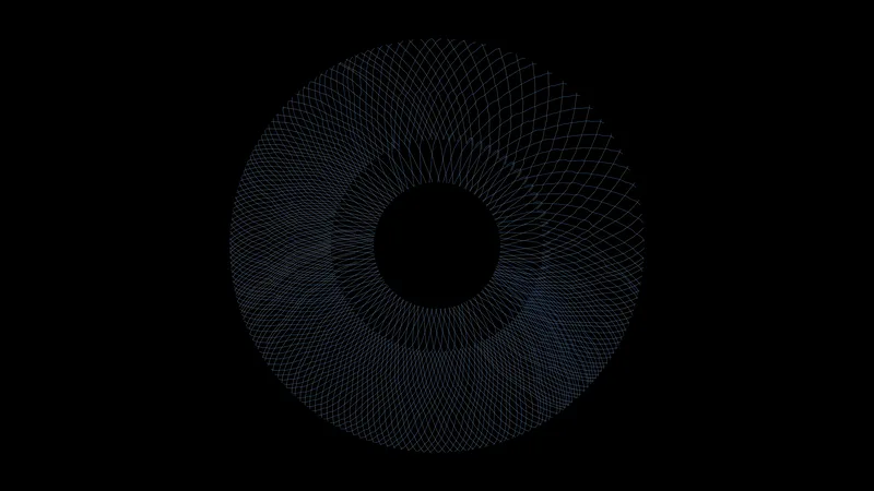
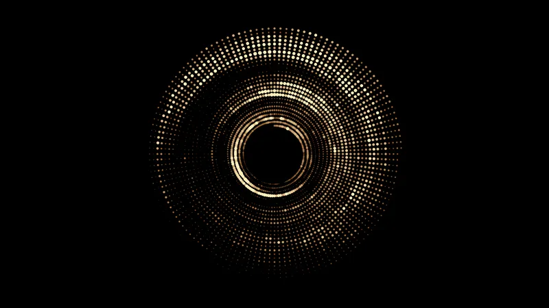
One turn is one year, with January 1 at the top. Each spoke is one day, drawn from sunrise to sunset: the inner edge is midnight and the outer edge is the next midnight. The dim tips are civil twilight. The white dots are solar noon, which drifts through the year (the equation of time). Times are Eastern Standard Time all year.

Data: Solar geometry (NOAA equations) for 40.71° N, 74.01° W

Download 3840 × 2160 · 1.4 MB
Sunlight map

Sunlight map

Mini-LED

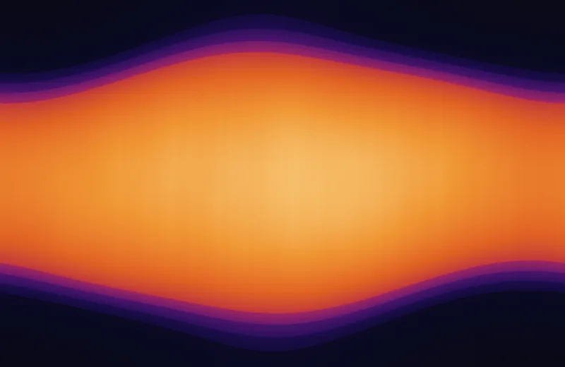
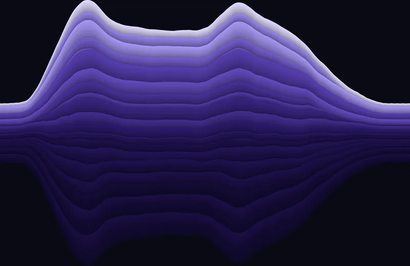
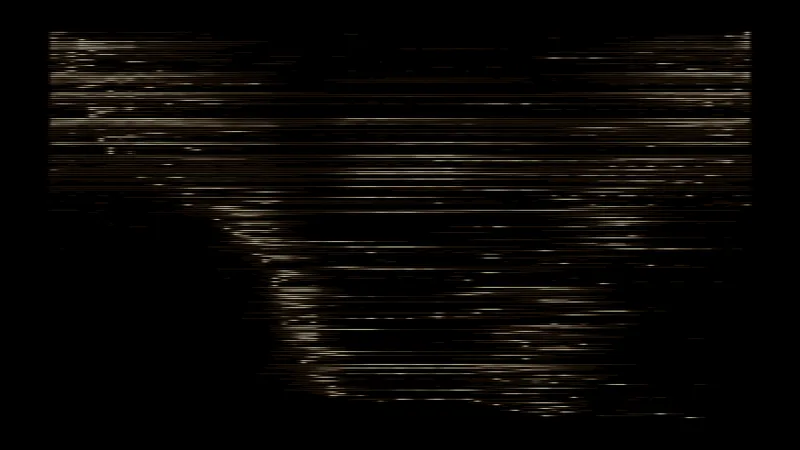
The year runs left to right and the day runs top to bottom, 01:30 to 22:30. The dark bands are night and the three twilight phases (astronomical, nautical, civil). Inside the day, the color is how much sunlight reaches the ground with average cloud. The faint vertical streaks are the cloud data.

Data: Solar geometry and 30 years of hourly cloud cover from the ERA5 reanalysis through the Open-Meteo archive

Download 3024 × 1964 · 4.2 MB
Temperature map

Temperature map

Mini-LED

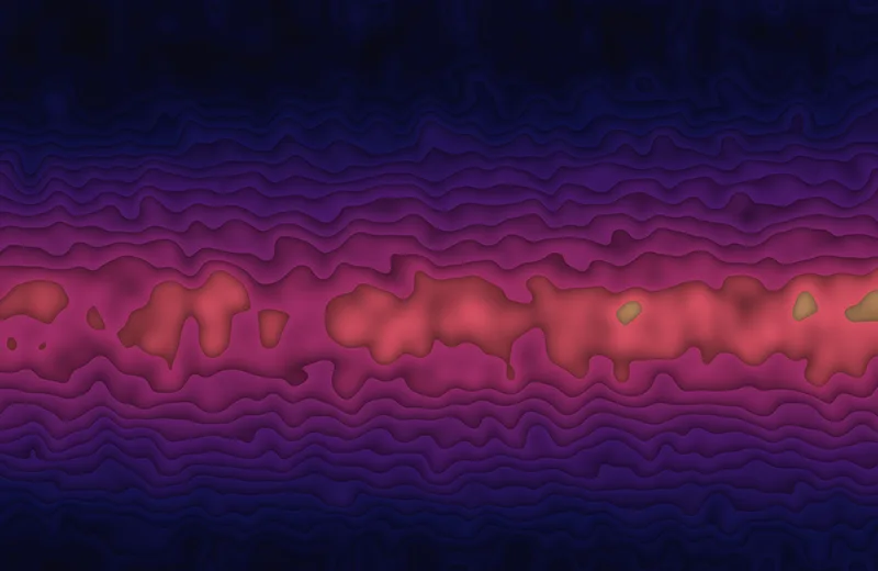
Mean air temperature for every hour of the year, 1995 to 2024. The year runs left to right and the day runs top to bottom. Each band is 2.5 °C. The warm core is a July afternoon; the cold corners are January nights.

Data: ERA5 reanalysis through the Open-Meteo archive

Download 3024 × 1964 · 6.4 MB
Battery tide

Battery tide

Mini-LED

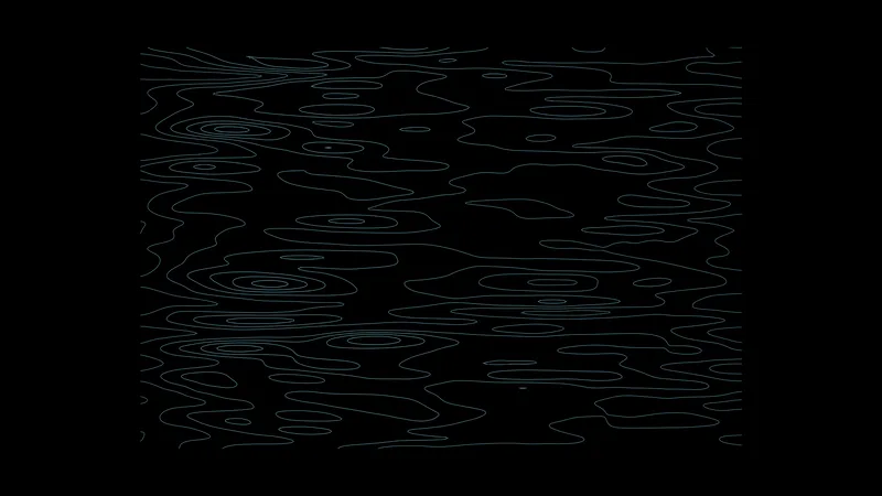
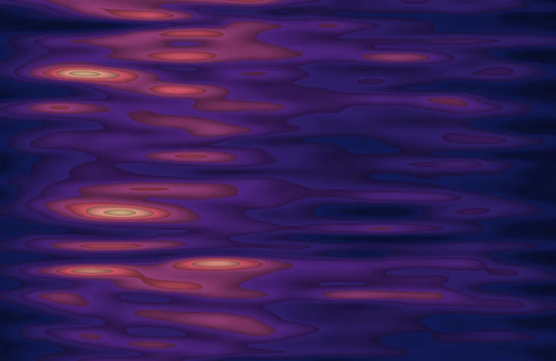
Predicted water level at The Battery for 60 days from June 1, 2025. The date runs left to right and the time of day runs top to bottom. High water comes about 50 minutes later each day, so the bands lean. They are fat at spring tide and thin at neap tide.

Data: NOAA CO-OPS tide predictions, station 8518750

Download 3024 × 1964 · 6.8 MB

New York heat maps

More of the city's rhythms laid out as fields: one axis is a kind of time, the other is another kind of time, or a place.

Electric load

Electric load

OLED

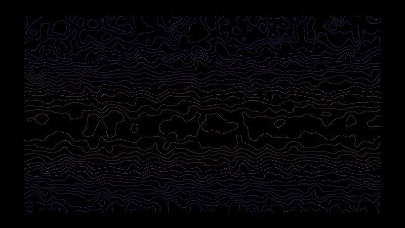
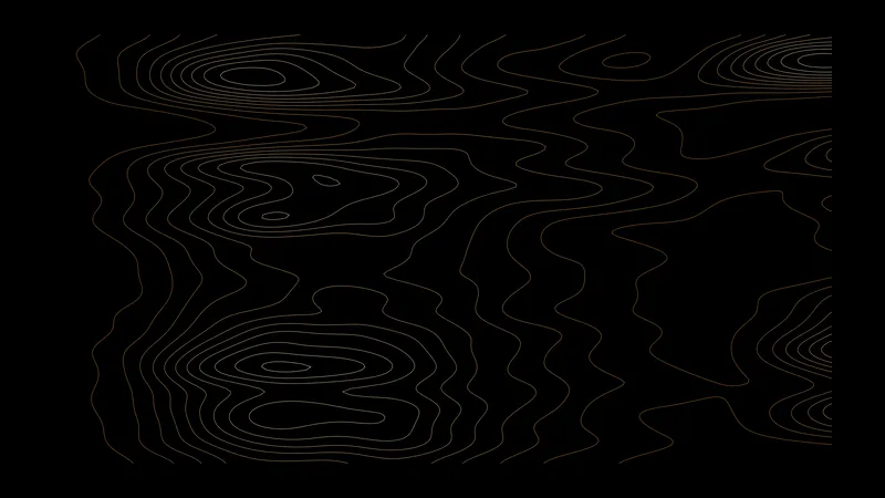
The electricity used by the New York City zone, averaged for each hour of the year over 2015 to 2024. Day of the year runs across and hour of the day runs down. The bright core is air conditioning on a summer afternoon. The small vertical steps are the daylight saving changes.

This version: Contour lines, one for each 200 MW.

Data: NYISO integrated real-time load, zone N.Y.C.

Download 3840 × 2160 · 1.0 MB
Electric load

Electric load

Mini-LED

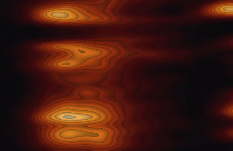
The electricity used by the New York City zone, averaged for each hour of the year over 2015 to 2024. Day of the year runs across and hour of the day runs down. The bright core is air conditioning on a summer afternoon. The small vertical steps are the daylight saving changes.

This version: Filled bands of 400 MW.

Data: NYISO integrated real-time load, zone N.Y.C.

Download 3024 × 1964 · 5.0 MB
Noise complaints

Noise complaints

OLED

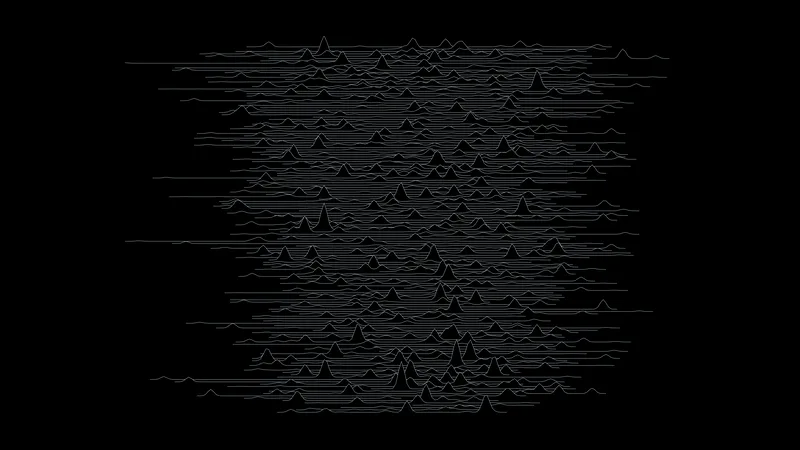
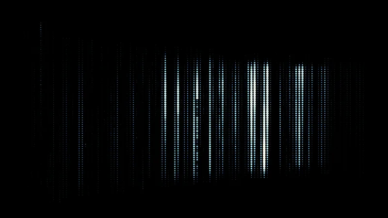
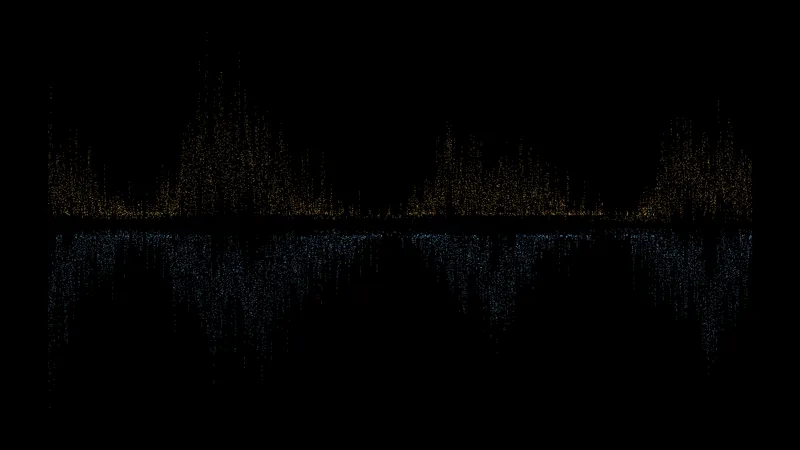
3.7 million 311 noise complaints from 2015 to 2024. The hour of the week runs across, starting Monday at noon, and the week of the year runs down. The seven bright columns are the seven nights. Friday and Saturday are the loudest, and summer is louder than winter.

This version: A ridgeline with one line for each week of the year.

Data: NYC Open Data, 311 service requests

Download 3840 × 2160 · 1.5 MB
Noise complaints

Noise complaints

Mini-LED

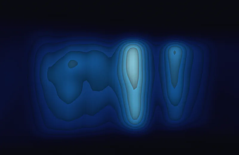
3.7 million 311 noise complaints from 2015 to 2024. The hour of the week runs across, starting Monday at noon, and the week of the year runs down. The seven bright columns are the seven nights. Friday and Saturday are the loudest, and summer is louder than winter.

This version: Filled contour bands.

Data: NYC Open Data, 311 service requests

Download 3024 × 1964 · 6.2 MB
Wind direction

Wind direction

OLED

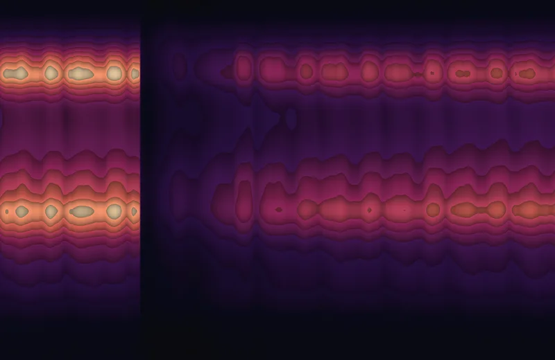
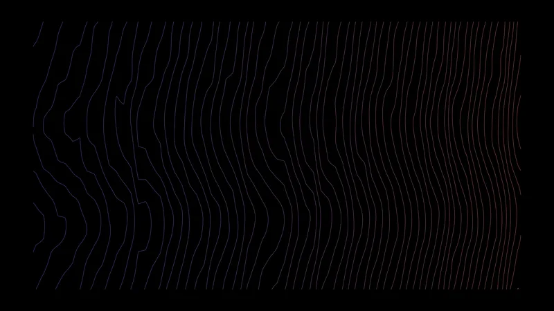
Which way the wind blows through the year, from 30 years of hourly data. Day of the year runs across and compass direction runs down; the color is the share of hours the wind comes from that direction.

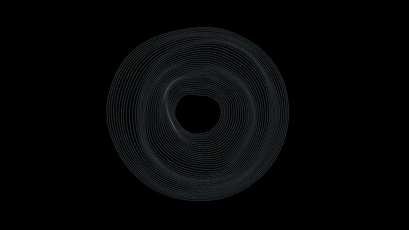
This version: 40 rings, one for each nine days. The angle is the compass direction.

Data: ERA5 reanalysis through the Open-Meteo archive

Download 3840 × 2160 · 1.0 MB
Wind direction

Wind direction

Mini-LED

Which way the wind blows through the year, from 30 years of hourly data. Day of the year runs across and compass direction runs down; the color is the share of hours the wind comes from that direction.

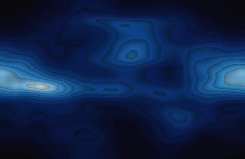
This version: Filled contour bands.

Data: ERA5 reanalysis through the Open-Meteo archive

Download 3024 × 1964 · 4.9 MB
Collisions

Collisions

OLED

2.2 million motor vehicle collisions from July 2012 to December 2025, by month (across) and hour of the day (down). The sharp edge is March 2020. Crashes recorded at exactly midnight are left out, because that minute collects records with no real time.

This version: A ridgeline with one line for each two months.

Data: NYC Open Data, motor vehicle collisions

Download 3840 × 2160 · 0.9 MB
Collisions

Collisions

Mini-LED

2.2 million motor vehicle collisions from July 2012 to December 2025, by month (across) and hour of the day (down). The sharp edge is March 2020. Crashes recorded at exactly midnight are left out, because that minute collects records with no real time.

This version: Filled contour bands.

Data: NYC Open Data, motor vehicle collisions

Download 3024 × 1964 · 5.4 MB
Building age

Building age

OLED

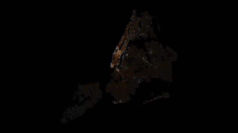
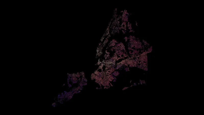
The mean year of construction of the buildings in each 500-foot cell of the city, from 815,000 tax lots.

This version: One point for each cell. The color is the age and the size is the mean number of floors.

Data: NYC PLUTO

Download 3840 × 2160 · 0.7 MB
Building age

Building age

Mini-LED

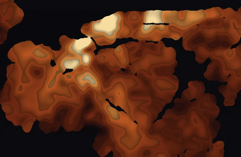
The mean year of construction of the buildings in each 500-foot cell of the city, from 815,000 tax lots.

This version: Filled bands of 10 years, turned so that uptown points right.

Data: NYC PLUTO

Download 3024 × 1964 · 5.5 MB

New York through time

Long records: a century and a half of weather and tide, two centuries of census.

Central Park snow

Central Park snow

OLED

Daily snowfall in Central Park for 157 winters, 1869 to 2026. Each line is one winter, from October 15 to May 1, drawn from its first snowfall to its last. Each peak is one storm.

Data: NOAA GHCN-Daily, station USW00094728

Download 3840 × 2160 · 1.0 MB
Central Park temperature

Central Park temperature

OLED

Daily mean temperature in Central Park from 1869 to 2025. One axis is the year and the other is the day of the year. The warm band of summer widens slowly toward the present.

This version: Contour lines, one for each 1.5 °C.

Data: NOAA GHCN-Daily, station USW00094728

Download 3840 × 2160 · 1.1 MB
Central Park temperature

Central Park temperature

Mini-LED

Daily mean temperature in Central Park from 1869 to 2025. One axis is the year and the other is the day of the year. The warm band of summer widens slowly toward the present.

This version: Filled bands of 2 °C.

Data: NOAA GHCN-Daily, station USW00094728

Download 3024 × 1964 · 4.9 MB
Year built

Year built

OLED

A random sample of the city's 818,000 tax lots, one point each, colored by the year the building went up: white for the oldest, then rose, then violet for the newest. The years of old buildings are estimates in the city's records.

Data: NYC PLUTO

Download 3840 × 2160 · 1.4 MB
Sea level at The Battery

Sea level at The Battery

OLED

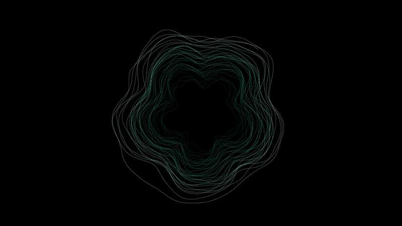
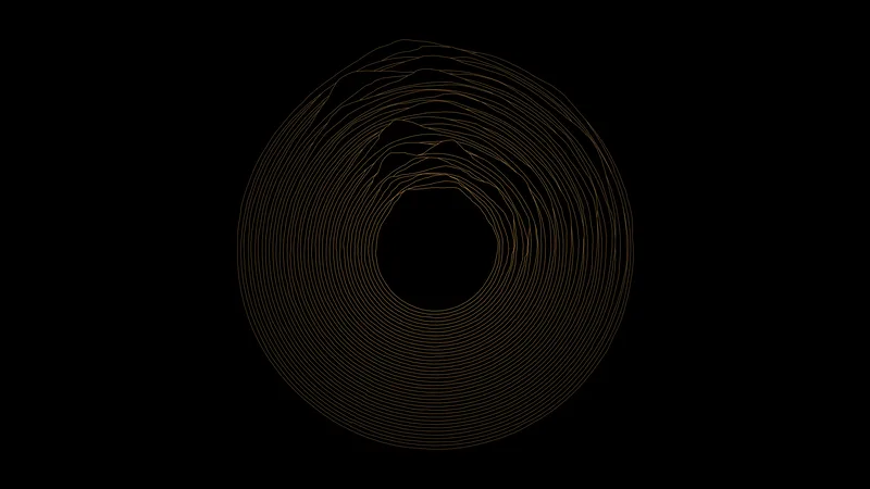
Monthly mean sea level from 1856 to 2026 as a spiral. One turn is five years and the radius is the water level, so the line winds outward as the sea rises. The five bumps in each turn are the yearly cycle.

Data: NOAA CO-OPS monthly mean sea level, station 8518750

Download 3840 × 2160 · 0.9 MB
Five boroughs

Five boroughs

OLED

Each borough's share of the city's population at every census from 1790 to 2020, as stacked bands. Manhattan starts with nearly everything and gives way to Brooklyn, Queens, and the Bronx. Before 1900 the Queens figure is old Queens County, which included what is now Nassau.

This version: One line for each 100,000 people.

Data: US census counts, from the borough articles on Wikipedia

Download 3840 × 2160 · 1.0 MB
Five boroughs

Five boroughs

Mini-LED

Each borough's share of the city's population at every census from 1790 to 2020, as stacked bands. Manhattan starts with nearly everything and gives way to Brooklyn, Queens, and the Bronx. Before 1900 the Queens figure is old Queens County, which included what is now Nassau.

This version: One stripe for each 250,000 people.

Data: US census counts, from the borough articles on Wikipedia

Download 3024 × 1964 · 4.3 MB

Subway

Ridership from the turnstiles and motion from the timetable.

Stations by hour

Stations by hour

OLED

424 stations on a 2025 weekday, sorted from the stations that are busiest in the morning to the ones that are busiest in the evening. The other axis is the hour of the day. Homes fill up one end and offices the other.

This version: A ridgeline with one line for each station.

Data: MTA hourly ridership, data.ny.gov

Download 3840 × 2160 · 0.6 MB
Stations by hour

Stations by hour

Mini-LED

424 stations on a 2025 weekday, sorted from the stations that are busiest in the morning to the ones that are busiest in the evening. The other axis is the hour of the day. Homes fill up one end and offices the other.

This version: Filled contour bands.

Data: MTA hourly ridership, data.ny.gov

Download 3024 × 1964 · 6.3 MB
Riders by week

Riders by week

OLED

Weekday riders by hour of the day for every week from 2018 to 2026. The two bright bands are the rush hours. The wall where they stop is March 2020, and what follows is the slow return.

This version: Contour lines.

Data: MTA hourly ridership, data.ny.gov

Download 3840 × 2160 · 0.8 MB
Riders by week

Riders by week

Mini-LED

Weekday riders by hour of the day for every week from 2018 to 2026. The two bright bands are the rush hours. The wall where they stop is March 2020, and what follows is the slow return.

This version: Filled contour bands.

Data: MTA hourly ridership, data.ny.gov

Download 3024 × 1964 · 4.8 MB
Morning and evening stations

Morning and evening stations

OLED

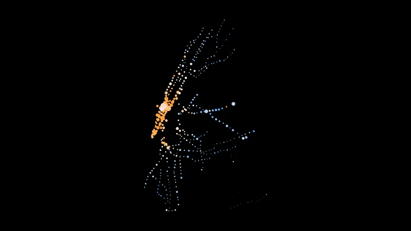
A map of every station. The area of each point is its ridership. Blue stations are busiest in the morning (where people live) and orange stations are busiest in the evening (where people work).

Data: MTA hourly ridership, data.ny.gov

Download 3840 × 2160 · 0.1 MB
The week as rings

The week as rings

OLED

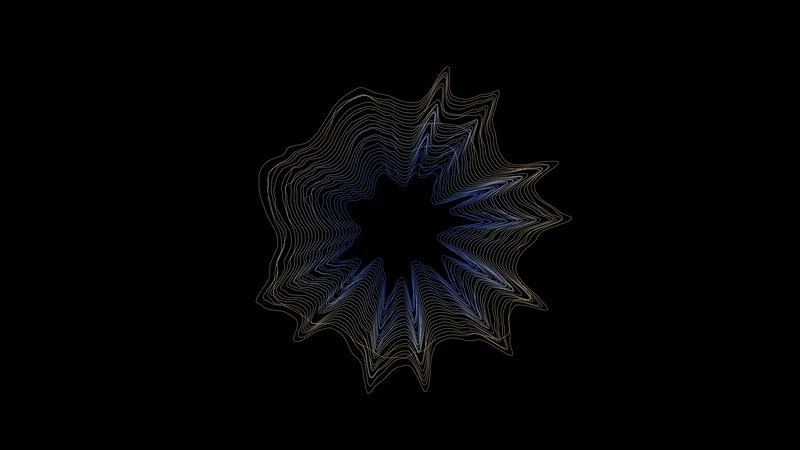
26 rings, one for every second week of 2025. The angle is the hour of the week and the distance from the ring is the number of riders. Five tall weekdays, two low weekend days.

Data: MTA hourly ridership, data.ny.gov

Download 3840 × 2160 · 1.0 MB
Daily riders by year

Daily riders by year

OLED

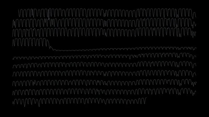
One line for each year from 2017 to 2026, showing riders for every day of that year. The sawtooth is the week. One line falls off a cliff.

Data: MTA hourly ridership, data.ny.gov

Download 3840 × 2160 · 0.9 MB
7 train, time against distance

7 train, time against distance

OLED

A Marey diagram of the 7 line on a weekday morning. One axis is the time and the other is the distance along the line, so each train is one sloped line and each stop is a point. Local trains are violet and express trains are white; the express lines are steeper because they are faster.

Data: MTA subway schedule (GTFS)

Download 3840 × 2160 · 1.7 MB
A train on a clock

A train on a clock

OLED

The same idea wrapped around a 24-hour clock for the A line. The angle is the time of day and the radius is the distance along the line. Blue trains run toward Manhattan and white trains run toward Queens. The thin part of the ring is the middle of the night.

Data: MTA subway schedule (GTFS)

Download 3840 × 2160 · 1.4 MB
Trains in motion

Trains in motion

OLED

How many trains are moving at each minute of a weekday, as a stack with one band for each route. The two swells are the morning and evening rush.

This version: The band edges as lines.

Data: MTA subway schedule (GTFS)

Download 3840 × 2160 · 0.7 MB
Trains in motion

Trains in motion

Mini-LED

How many trains are moving at each minute of a weekday, as a stack with one band for each route. The two swells are the morning and evening rush.

This version: Filled bands.

Data: MTA subway schedule (GTFS)

Download 3024 × 1964 · 4.3 MB
Reach from Times Square

Reach from Times Square

OLED

How long it takes to get anywhere from Times Square by subway and then on foot, in 10-minute bands. The times are computed from the timetable, with a straight walk at 5 km/h from the nearest station, so the bands over water are not real.

This version: Contour lines.

Data: MTA subway schedule (GTFS), travel times computed

Download 3840 × 2160 · 0.9 MB
Reach from Times Square

Reach from Times Square

Mini-LED

How long it takes to get anywhere from Times Square by subway and then on foot, in 10-minute bands. The times are computed from the timetable, with a straight walk at 5 km/h from the nearest station, so the bands over water are not real.

This version: Filled bands.

Data: MTA subway schedule (GTFS), travel times computed

Download 3024 × 1964 · 4.8 MB
Who rides where

Who rides where

OLED

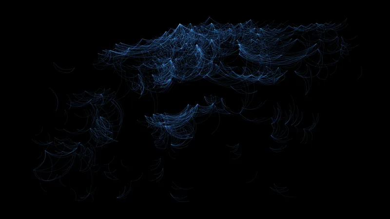
Arcs between pairs of stations on an average weekday in October 2024. The brightness is the number of riders making that trip, and the color is the length of the trip. Everything bends toward Midtown.

Data: MTA origin-destination ridership estimate, data.ny.gov

Download 3840 × 2160 · 1.4 MB

Streets and bikes

Maps made only of lines, and a month of Citi Bike trips.

Midtown Manhattan

Midtown Manhattan

OLED

Every street in Midtown, turned so the avenues run straight. The dark bands are the Hudson and the East River, and the dark rectangle is Central Park.

Data: OpenStreetMap through the Overpass API

Download 3840 × 2160 · 1.2 MB
Barcelona by compass

Barcelona by compass

OLED

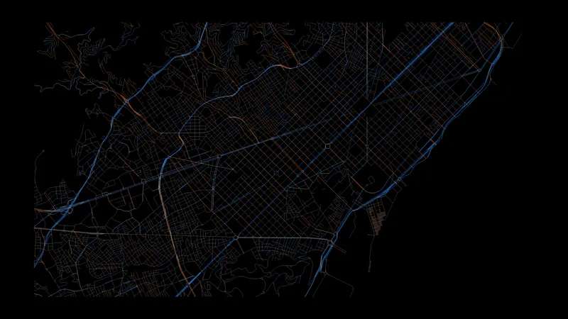
The streets of Barcelona, colored by the compass direction of each segment. The two directions of the Eixample grid come out blue and orange, and the old city in between is every color at once.

Data: OpenStreetMap through the Overpass API

Download 3840 × 2160 · 2.0 MB
Paris

Paris

OLED

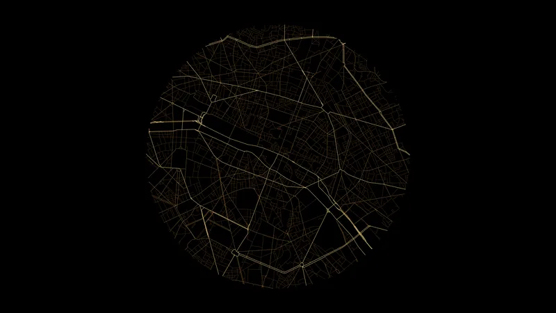
Paris in a circle around the Île de la Cité. The boulevards are bright and the small streets are dim.

Data: OpenStreetMap through the Overpass API

Download 3840 × 2160 · 1.0 MB
Venice canals

Venice canals

OLED

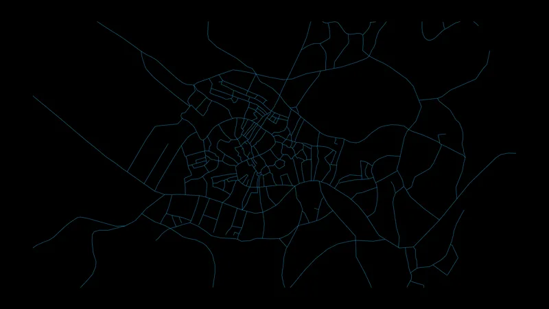
Only the waterways of Venice and its lagoon. The map data has no outline for the islands here, so the canals float on black.

Data: OpenStreetMap through the Overpass API

Download 3840 × 2160 · 0.4 MB
New York rail

New York rail

OLED

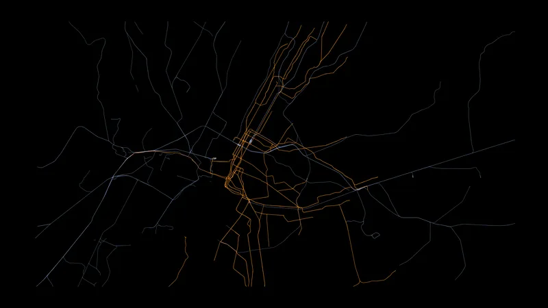
Only the rail lines of New York City. The subway is orange and every other railway is blue-white.

Data: OpenStreetMap through the Overpass API

Download 3840 × 2160 · 0.5 MB
Citi Bike arcs

Citi Bike arcs

OLED

Arcs between the busiest pairs of Citi Bike stations in New York in April 2026. The brightness of an arc is the number of trips between the two stations. The data covers part of the month.

Data: Citi Bike trip data

Download 3840 × 2160 · 1.7 MB
Citi Bike stations

Citi Bike stations

OLED

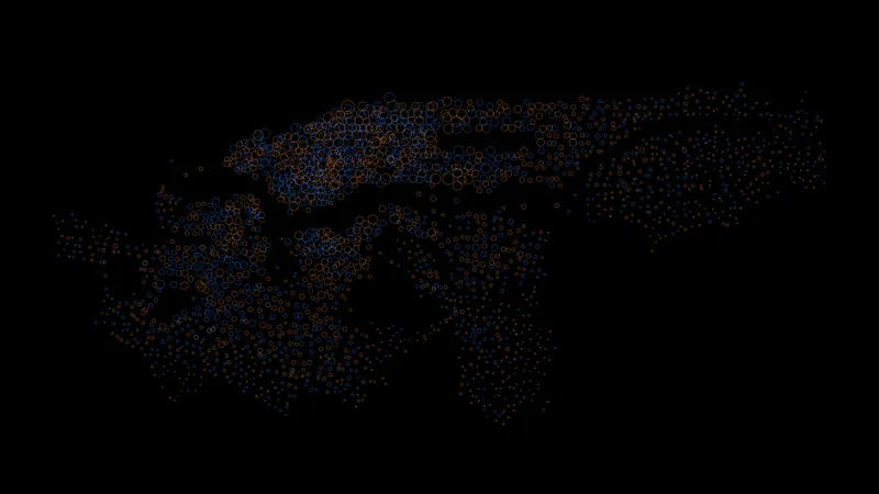
One ring for each station. The area is the number of departures. Orange stations receive more bikes than they send out and blue stations send more than they receive, which is roughly downhill and uphill.

Data: Citi Bike trip data

Download 3840 × 2160 · 0.8 MB
A year of bike weeks

A year of bike weeks

OLED

Jersey City and Hoboken in 2025. Each line is one week, Monday to Sunday, with January at the top; the height is the number of trips starting in each hour. The commute peaks grow through spring and shrink again in the fall.

Data: Citi Bike trip data

Download 3840 × 2160 · 1.6 MB
Bike clock

Bike clock

OLED

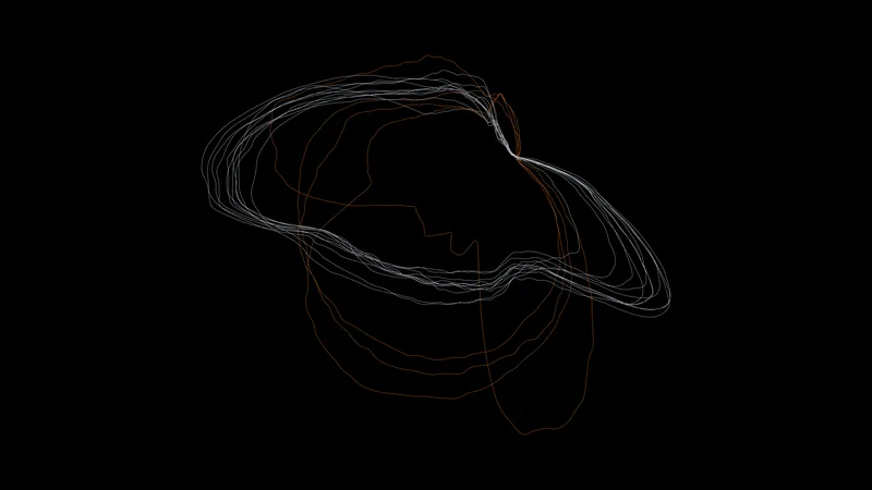
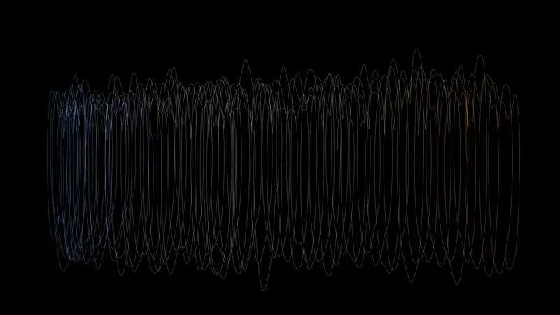
One closed curve for each day from April 1 to 15, 2026. Midnight is at the top, time runs clockwise, and the distance from the center is the number of trips starting then. Working days have two lobes. Weekend days are orange and have one.

Data: Citi Bike trip data

Download 3840 × 2160 · 0.5 MB
One morning of trips

One morning of trips

OLED

Every Citi Bike trip between 07:30 and 09:30 on Wednesday, April 15, 2026, as a line from its start to its end. One axis is the time and the other is the position along Manhattan. Blue trips go uptown and orange trips go downtown; a steep line is a fast ride.

Data: Citi Bike trip data

Download 3840 × 2160 · 1.9 MB

Birds

Weather radar sees birds. BirdCast turns that into a count of birds in flight each night, and millions of sightings on GBIF say which species were where.

Fall nights

Fall nights

OLED

Fall 2025 over New York State. Each line is one night, from dusk to dawn, and the height is the number of birds in flight. A few huge nights carry most of the migration.

Data: BirdCast migration dashboard (weather radar)

Download 3840 × 2160 · 0.5 MB
Spring nights

Spring nights

OLED

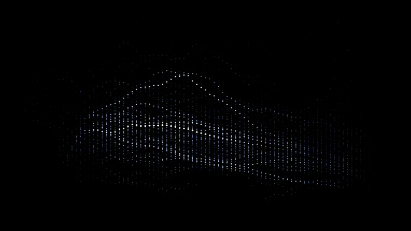
Spring 2025 over New York State. One axis is the night and the other is the time of night; the value is the number of birds in the air.

This version: A matrix of points.

Data: BirdCast migration dashboard (weather radar)

Download 3840 × 2160 · 0.5 MB
Spring nights

Spring nights

Mini-LED

Spring 2025 over New York State. One axis is the night and the other is the time of night; the value is the number of birds in the air.

This version: Filled contour bands, smoothed over seven nights.

Data: BirdCast migration dashboard (weather radar)

Download 3024 × 1964 · 4.7 MB
Night flights

Night flights

OLED

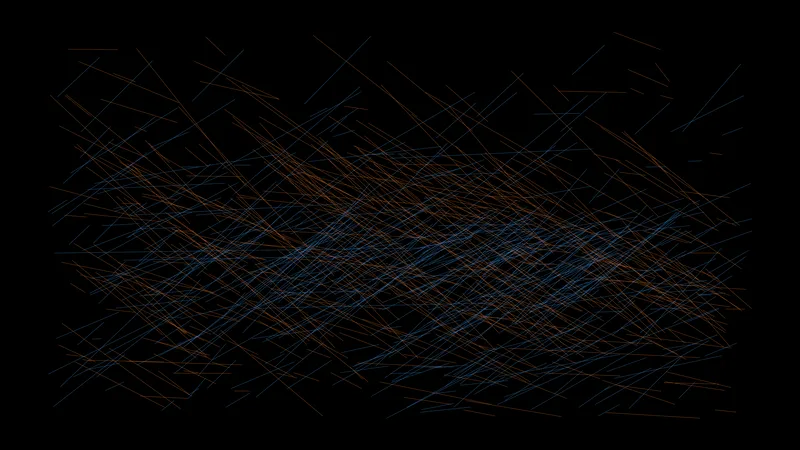
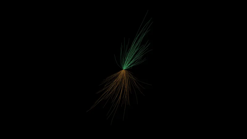
One path for each night of 2025, built from the direction and speed the radar measured through that night. Spring nights are green and head north. Fall nights are orange and head south.

Data: BirdCast migration dashboard (weather radar)

Download 3840 × 2160 · 0.4 MB
Five years of migration

Five years of migration

OLED

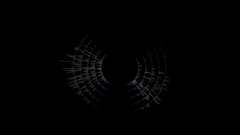
2021 to 2025 as five rings. Each radial line is one night and its length is the number of birds that crossed New York State. Two bursts a year.

Data: BirdCast migration dashboard (weather radar)

Download 3840 × 2160 · 0.3 MB
Flight height

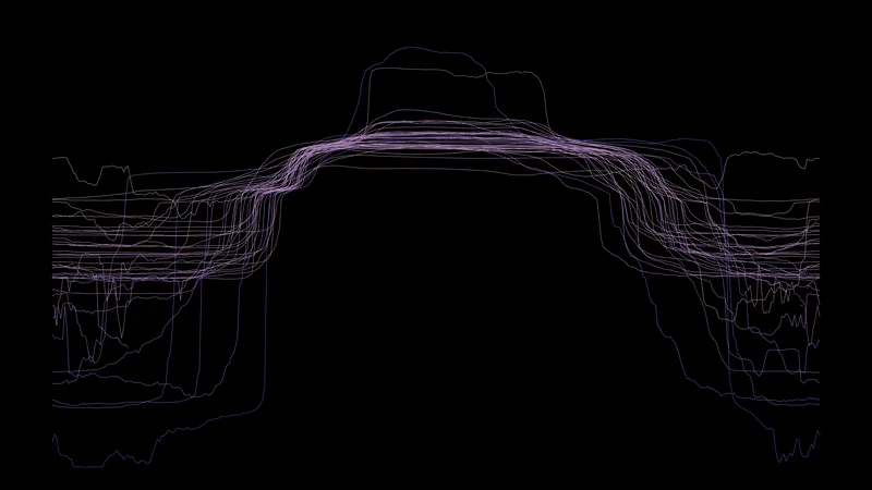
Flight height

OLED

Fall 2025. One point for each ten-minute radar sample: the time of night across, the mean flight height up. Birds climb after dusk and come down before dawn.

Data: BirdCast migration dashboard (weather radar)

Download 3840 × 2160 · 0.3 MB
The spring wave

The spring wave

OLED

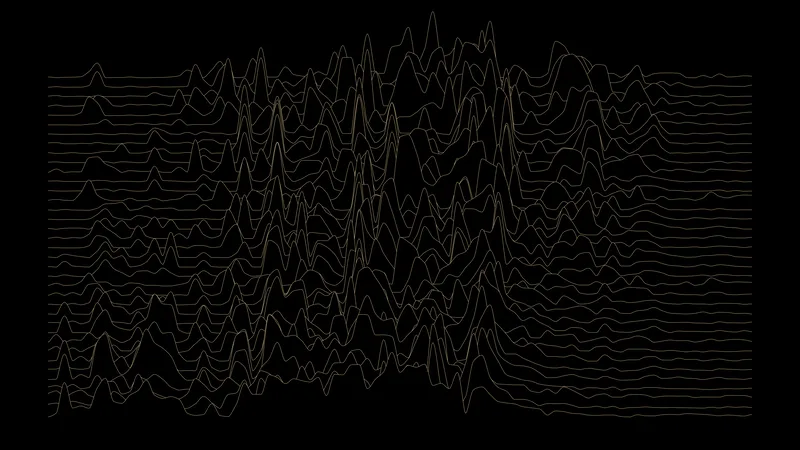
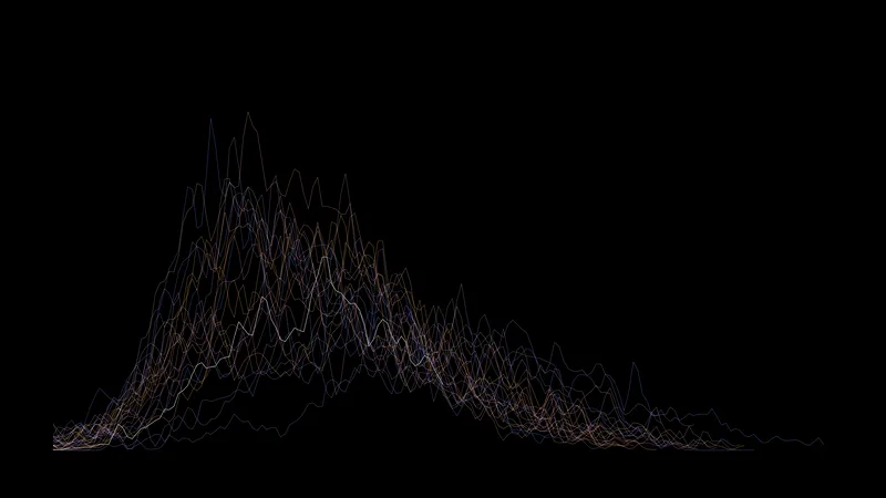
The birds that crossed each of the 37 states east of 104° W on each night of spring 2025, with the states in order from north to south. The migration reaches the north later, so the shape leans.

This version: A gold ridgeline with one line for each state.

Data: BirdCast migration dashboard (weather radar)

Download 3840 × 2160 · 1.2 MB
The spring wave

The spring wave

Mini-LED

The birds that crossed each of the 37 states east of 104° W on each night of spring 2025, with the states in order from north to south. The migration reaches the north later, so the shape leans.

This version: Bands showing how much of the season has passed; the brightest band is the halfway point.

Data: BirdCast migration dashboard (weather radar)

Download 3024 × 1964 · 6.4 MB
Two peak nights

Two peak nights

OLED

A map with no borders. Each state has two paths starting from its center: green for the biggest night of spring 2025 (May 13) and pink for the biggest night of fall (October 8). The width is the number of birds in flight.

Data: BirdCast migration dashboard (weather radar)

Download 3840 × 2160 · 0.4 MB
Blackpoll warbler

Blackpoll warbler

OLED

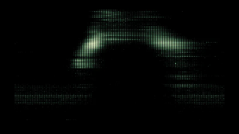
1.07 million sightings of one small bird, by latitude and day of the year. It summers in the boreal forest and winters in South America, so the sightings make an arch. Sightings also show where birdwatchers are.

This version: A matrix of dots sized by the number of sightings.

Data: GBIF occurrence records

Download 3840 × 2160 · 0.4 MB
Blackpoll warbler

Blackpoll warbler

Mini-LED

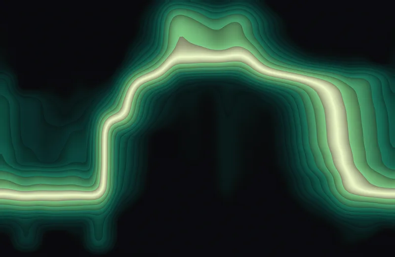
1.07 million sightings of one small bird, by latitude and day of the year. It summers in the boreal forest and winters in South America, so the sightings make an arch. Sightings also show where birdwatchers are.

This version: Bands of the latitude distribution on each date; the brightest band is the median.

Data: GBIF occurrence records

Download 3024 × 1964 · 5.5 MB
40 migrants

40 migrants

OLED

One line for each of 40 migrant species of the Americas: the median latitude of its sightings through the year, January to December. They leave together and come back together.

Data: GBIF occurrence records

Download 3840 × 2160 · 1.1 MB
Central Park through the year

Central Park through the year

OLED

211 bird species recorded in Central Park, one thin row each, with the year running across. A row is bright when that species is being seen. The rows are in order of arrival: residents at the top, then the diagonal of spring arrivals, then the fall return on the right.

Data: GBIF occurrence records

Download 3840 × 2160 · 0.7 MB

Migration paths

Real tracks from GPS and satellite tags on individual animals, over a dim coastline. On the desktop versions north is to the left, so that the long routes fill the screen.

Ospreys

Ospreys

OLED

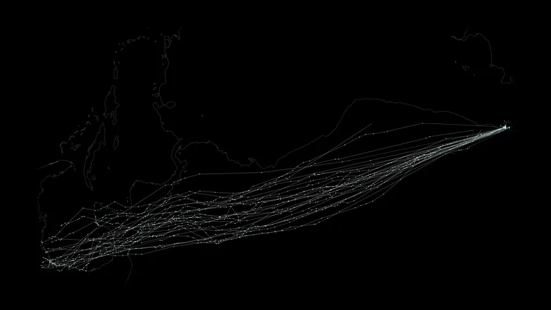
Ospreys tagged at nests along the Atlantic coast, many on Long Island, flying to South America and back, 1995 to 2002. Orange is the trip south and green is the trip north.

Data: Movebank Data Repository, doi:10.5441/001/1.sv6335t3

Download 3840 × 2160 · 1.0 MB
White storks

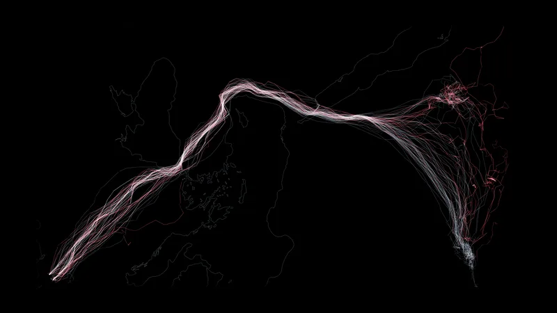
White storks

OLED

105 white storks from Germany, 2011 to 2013. They funnel across the Bosphorus and down through Israel to the Sahel. Adults are white and young birds are red; brighter means faster.

Data: Movebank Data Repository, doi:10.5441/001/1.hn1bd23k

Download 3840 × 2160 · 1.5 MB
Hudsonian godwits

Hudsonian godwits

OLED

25 godwits flying from Chiloé in Chile to the Gulf of Mexico without stopping, 2019 to 2021. Each point is one tag fix, and the color runs from teal to white with speed.

Data: Movebank Data Repository, doi:10.5441/001/1.t81488n5

Download 3840 × 2160 · 0.8 MB
Far Eastern curlews

Far Eastern curlews

OLED

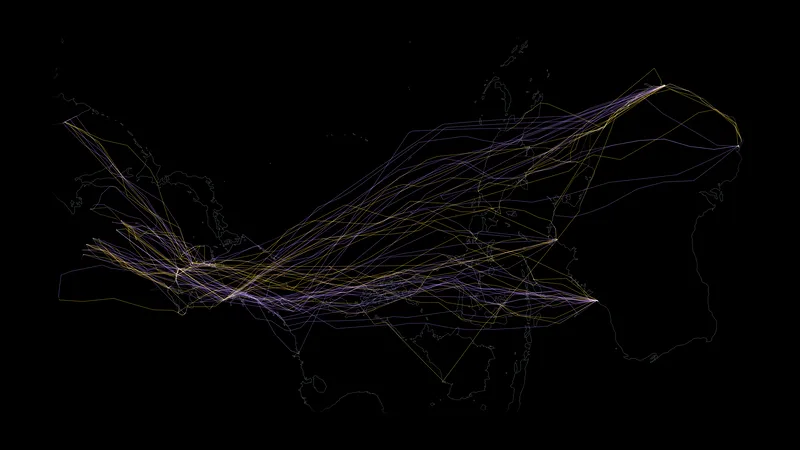
21 curlews from four parts of Australia flying to the Yellow Sea and on to Russia, 2017 to 2021. Violet is the trip north and yellow is the trip south. The tags report rarely on the long legs, so the paths are straight strokes.

Data: Movebank Data Repository, doi:10.5441/001/1.v8r49083

Download 3840 × 2160 · 1.2 MB
Humpback whales

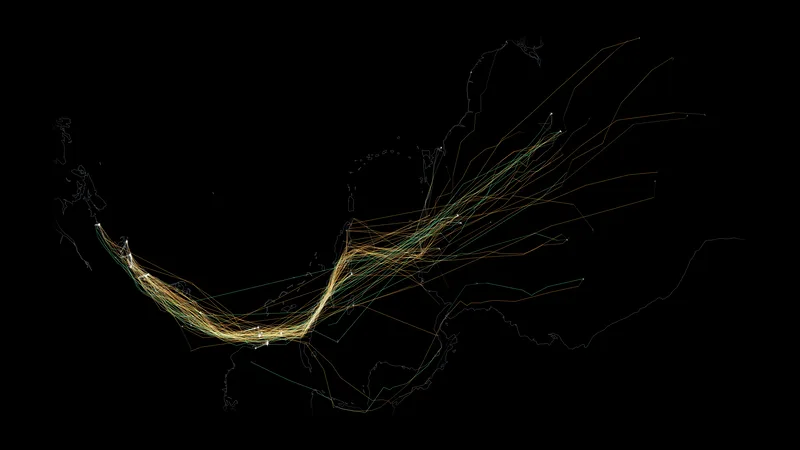
Humpback whales

OLED

44 humpback whales swimming from the east coast of Australia to Antarctica, 2008 to 2011. The color follows latitude: green in warm water, blue in the Southern Ocean, white near the ice.

Data: Movebank Data Repository, doi:10.5441/001/1.294

Download 3840 × 2160 · 0.5 MB

Ocean

Satellites measure the temperature and the height of the sea surface. The currents come from the height.
Gulf Stream temperature

Gulf Stream temperature

OLED

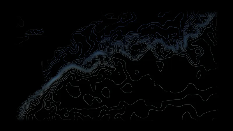
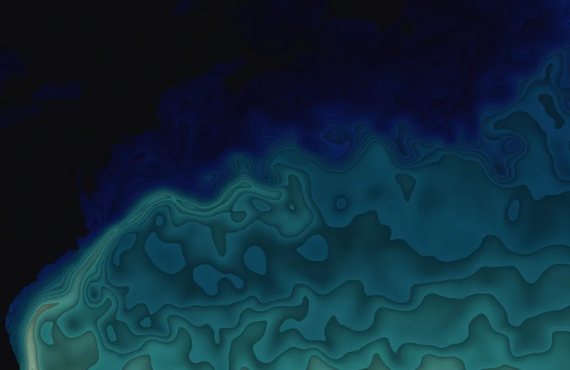
Sea surface temperature in the western North Atlantic on March 1, 2025. The Gulf Stream hugs the coast, leaves it at Cape Hatteras, and breaks into meanders.

This version: Isotherm lines.

Data: NOAA OISST v2.1 through CoastWatch ERDDAP

Download 3840 × 2160 · 1.0 MB
Gulf Stream temperature

Gulf Stream temperature

Mini-LED

Sea surface temperature in the western North Atlantic on March 1, 2025. The Gulf Stream hugs the coast, leaves it at Cape Hatteras, and breaks into meanders.

This version: Filled contour bands.

Data: NOAA OISST v2.1 through CoastWatch ERDDAP

Download 3024 × 1964 · 5.2 MB

Kuroshio temperature

Kuroshio temperature

OLED

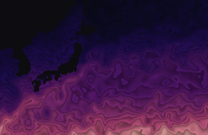
Sea surface temperature east of Japan on April 15, 2025, where the warm Kuroshio meets the cold Oyashio.

This version: A ridgeline of temperature profiles, one for each latitude.

Data: NOAA OISST v2.1 through CoastWatch ERDDAP

Download 3840 × 2160 · 1.3 MB
Kuroshio temperature

Kuroshio temperature

Mini-LED

Sea surface temperature east of Japan on April 15, 2025, where the warm Kuroshio meets the cold Oyashio.

This version: Filled contour bands.

Data: NOAA OISST v2.1 through CoastWatch ERDDAP

Download 3024 × 1964 · 5.6 MB
Agulhas temperature

Agulhas temperature

OLED

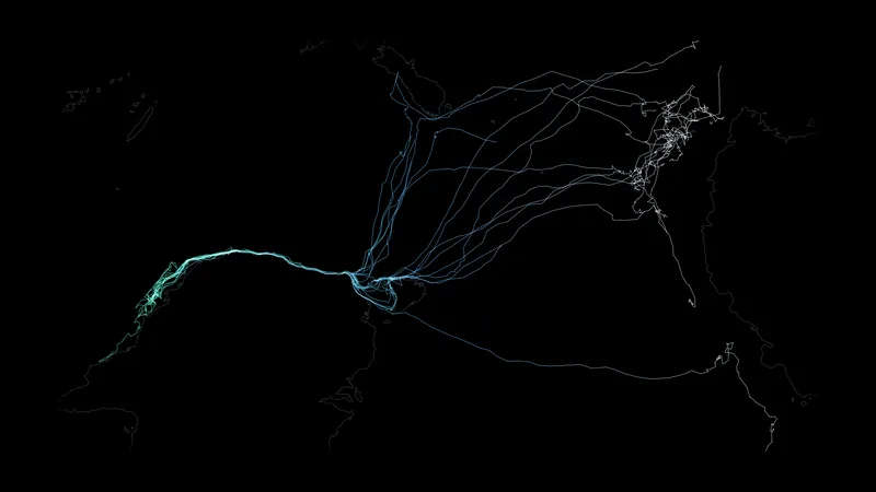
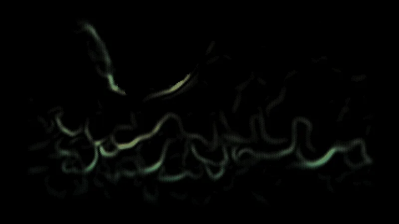
Sea surface temperature south of Africa on February 15, 2025. The Agulhas Current runs down the coast, overshoots the continent, and turns back east.

This version: Points sized by how fast the temperature changes, so the fronts light up.

Data: NOAA OISST v2.1 through CoastWatch ERDDAP

Download 3840 × 2160 · 0.6 MB
Agulhas temperature

Agulhas temperature

Mini-LED

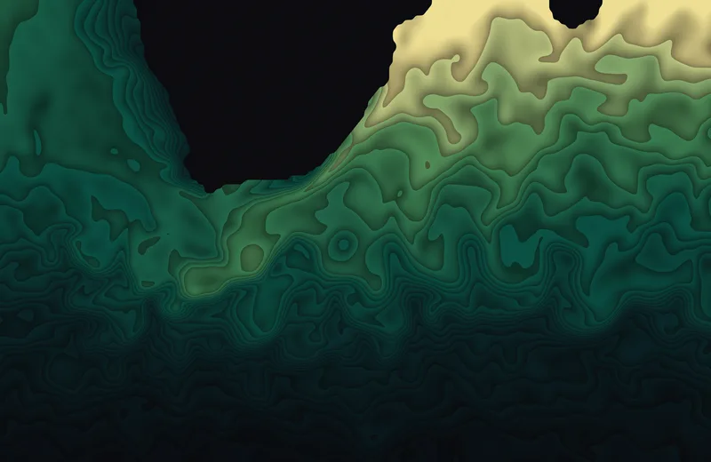
Sea surface temperature south of Africa on February 15, 2025. The Agulhas Current runs down the coast, overshoots the continent, and turns back east.

This version: Filled contour bands.

Data: NOAA OISST v2.1 through CoastWatch ERDDAP

Download 3024 × 1964 · 5.3 MB
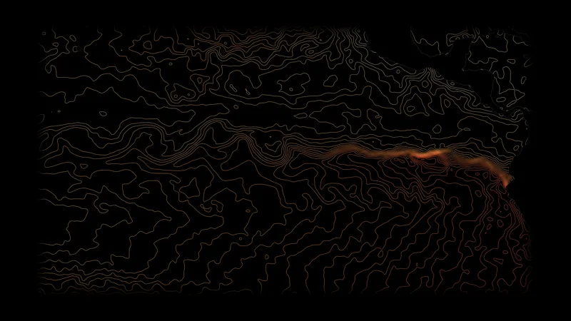
Pacific cold tongue

Pacific cold tongue

OLED

The eastern equatorial Pacific on October 1, 2022, during La Niña. Cold water wells up along the equator, and waves in the current scallop its edge.

This version: Isotherm lines every 0.5 °C.

Data: NOAA OISST v2.1 through CoastWatch ERDDAP

Download 3840 × 2160 · 1.2 MB
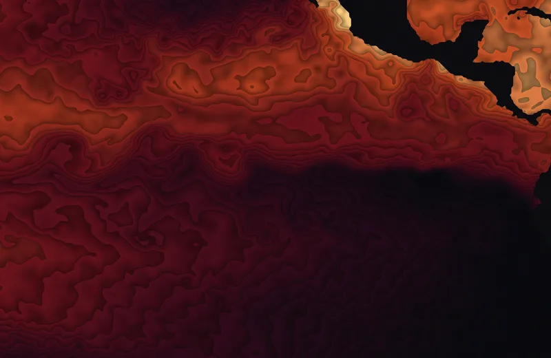
Pacific cold tongue

Pacific cold tongue

Mini-LED

The eastern equatorial Pacific on October 1, 2022, during La Niña. Cold water wells up along the equator, and waves in the current scallop its edge.

This version: Filled contour bands.

Data: NOAA OISST v2.1 through CoastWatch ERDDAP

Download 3024 × 1964 · 6.0 MB
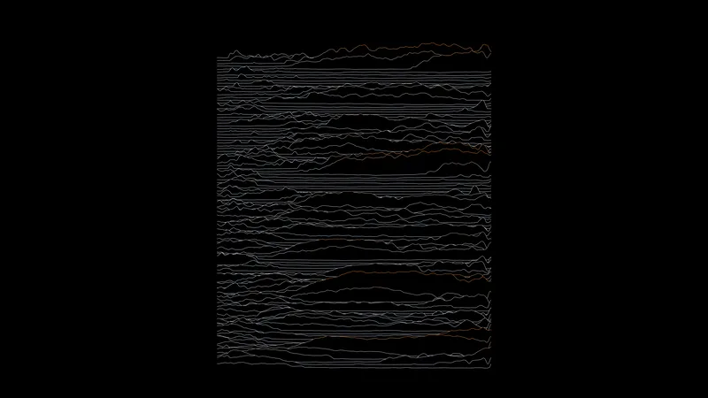
El Niño through time

El Niño through time

OLED

How much warmer or colder than normal the equator of the Pacific is, with longitude on one axis and time on the other. Each El Niño is a warm ridge.

This version: A ridgeline of the whole record, 1982 to 2025.

Data: NOAA OISST v2.1 through CoastWatch ERDDAP

Download 3840 × 2160 · 0.8 MB
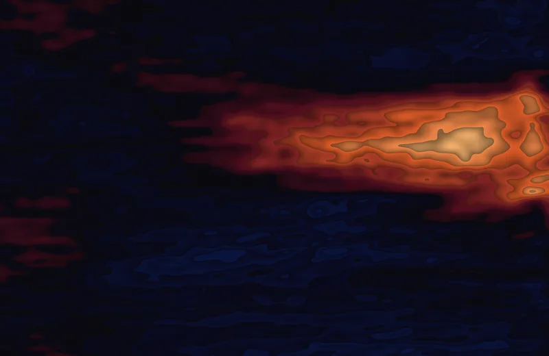
El Niño through time

El Niño through time

Mini-LED

How much warmer or colder than normal the equator of the Pacific is, with longitude on one axis and time on the other. Each El Niño is a warm ridge.

This version: Only 1996 to 2000: the 1997–98 El Niño as one warm shape.

Data: NOAA OISST v2.1 through CoastWatch ERDDAP

Download 3024 × 1964 · 4.6 MB
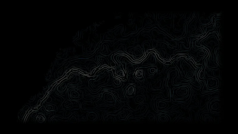
Gulf Stream currents

Gulf Stream currents

OLED

Surface currents on March 1, 2025. The stream is the bright ribbon, and the rings beside it are eddies it has shed.

This version: Evenly spaced flow lines.

Data: NOAA CoastWatch altimetry currents

Download 3840 × 2160 · 1.4 MB
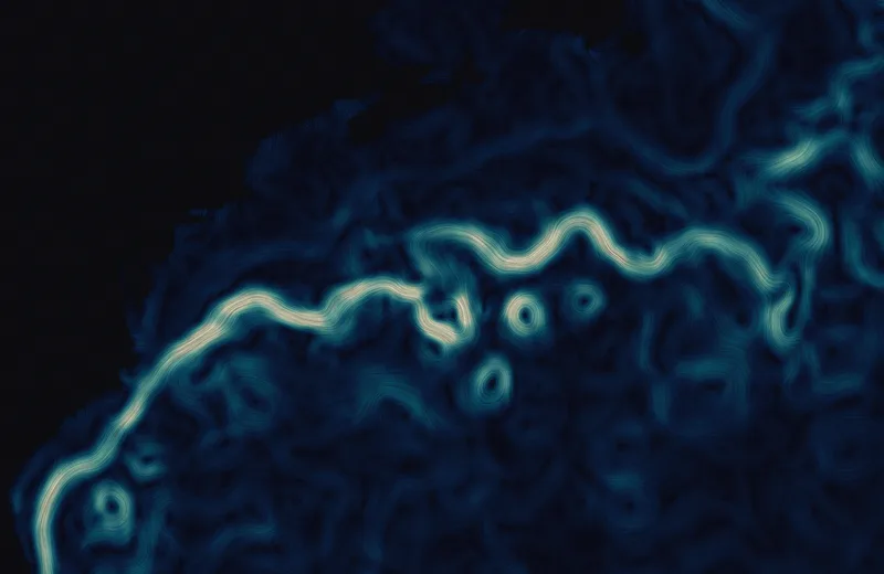
Gulf Stream currents

Gulf Stream currents

Mini-LED

Surface currents on March 1, 2025. The stream is the bright ribbon, and the rings beside it are eddies it has shed.

This version: Flow streaks; the color is the speed.

Data: NOAA CoastWatch altimetry currents

Download 3024 × 1964 · 8.5 MB
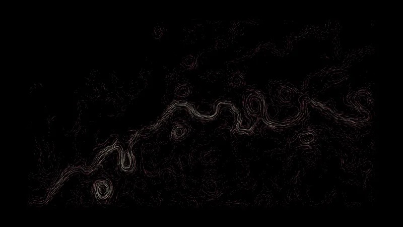
Kuroshio currents

Kuroshio currents

OLED

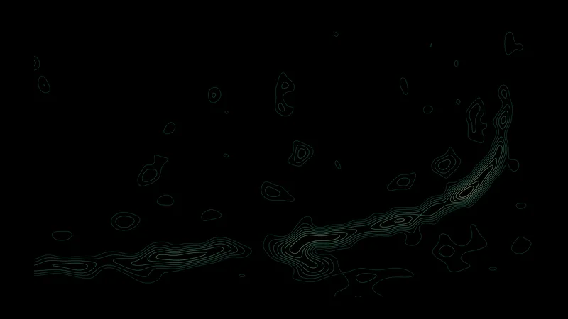
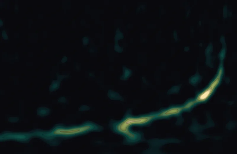
Surface currents east of Japan on April 15, 2025.

This version: Short traces; a longer trace is a faster current.

Data: NOAA CoastWatch altimetry currents

Download 3840 × 2160 · 1.6 MB
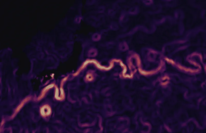
Kuroshio currents

Kuroshio currents

Mini-LED

Surface currents east of Japan on April 15, 2025.

This version: Flow streaks; the color is the speed.

Data: NOAA CoastWatch altimetry currents

Download 3024 × 1964 · 9.2 MB
Agulhas retroflection

Agulhas retroflection

OLED

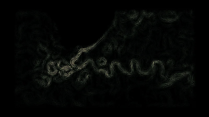
Surface currents south of Africa on February 15, 2025. The Agulhas Current turns back on itself and runs east as a chain of meanders.

This version: Points along the flow lines.

Data: NOAA CoastWatch altimetry currents

Download 3840 × 2160 · 1.4 MB
Agulhas retroflection

Agulhas retroflection

Mini-LED

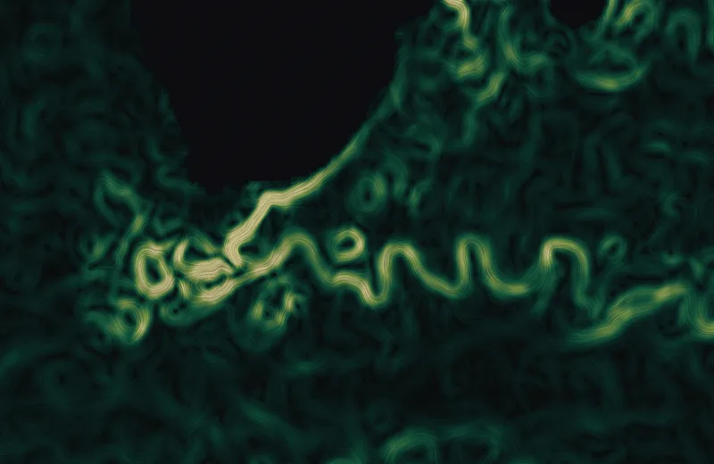
Surface currents south of Africa on February 15, 2025. The Agulhas Current turns back on itself and runs east as a chain of meanders.

This version: Flow streaks; the color is the speed.

Data: NOAA CoastWatch altimetry currents

Download 3024 × 1964 · 8.6 MB
Brazil–Malvinas confluence

Brazil–Malvinas confluence

OLED

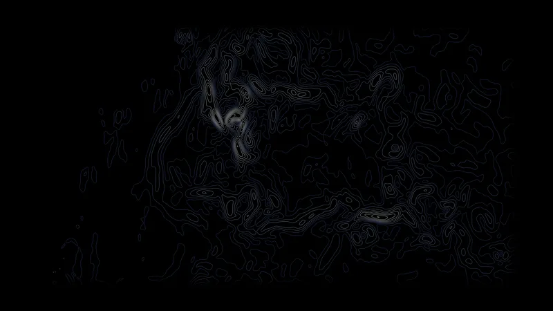
Where the warm Brazil Current meets the cold Malvinas Current off Argentina, and the Drake Passage to the south, on March 1, 2025.

This version: Lines of equal speed.

Data: NOAA CoastWatch altimetry currents

Download 3840 × 2160 · 1.3 MB
Brazil–Malvinas confluence

Brazil–Malvinas confluence

Mini-LED

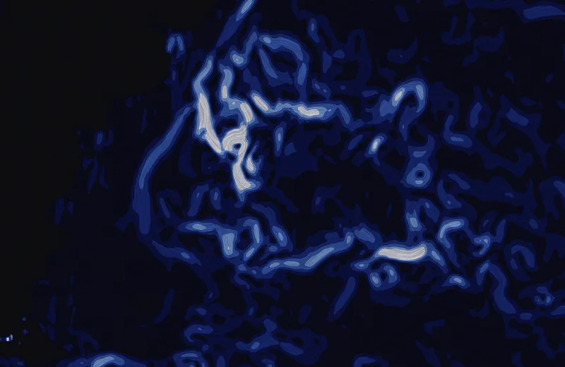
Where the warm Brazil Current meets the cold Malvinas Current off Argentina, and the Drake Passage to the south, on March 1, 2025.

This version: Flow streaks with the speed in six bands.

Data: NOAA CoastWatch altimetry currents

Download 3024 × 1964 · 7.8 MB
Equatorial currents

Equatorial currents

OLED

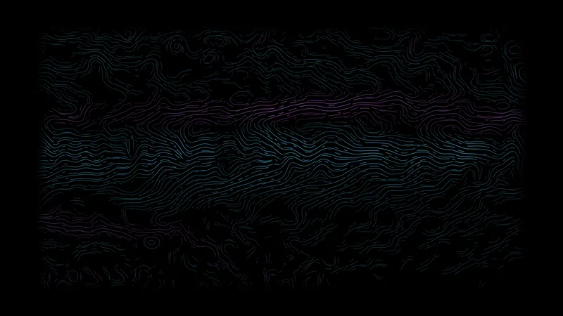
The Pacific along the equator on October 1, 2013. The color says whether the water moves east or west; the bands alternate.

This version: Flow lines in two colors.

Data: NASA OSCAR through CoastWatch ERDDAP

Download 3840 × 2160 · 1.4 MB
Equatorial currents

Equatorial currents

Mini-LED

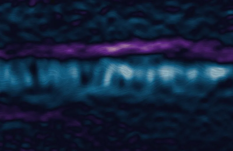
The Pacific along the equator on October 1, 2013. The color says whether the water moves east or west; the bands alternate.

This version: Flow streaks.

Data: NASA OSCAR through CoastWatch ERDDAP

Download 3024 × 1964 · 10.0 MB
Off New York

Off New York

OLED

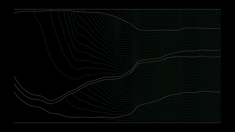
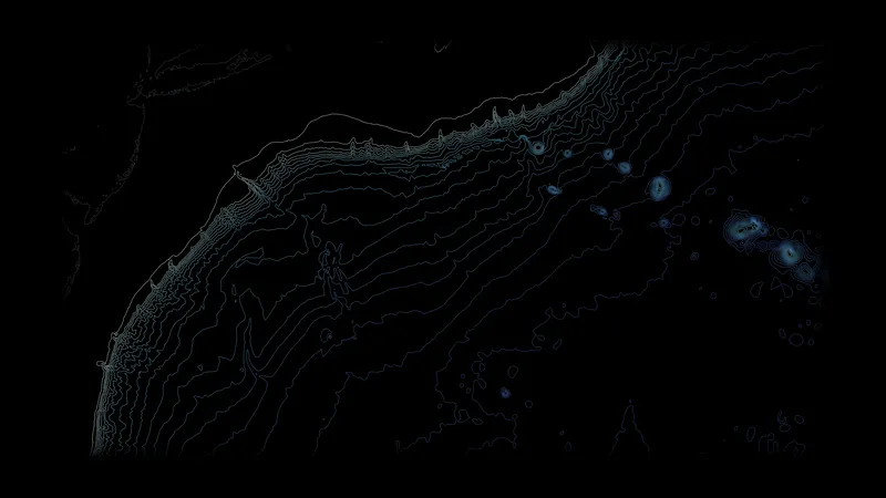
The sea floor off New York: the wide shelf, the edge where it drops away, the Hudson Canyon cutting through it, and the New England Seamounts.

This version: Depth contour lines.

Data: Terrain tiles on AWS (terrarium)

Download 3840 × 2160 · 1.0 MB
Off New York

Off New York

Mini-LED

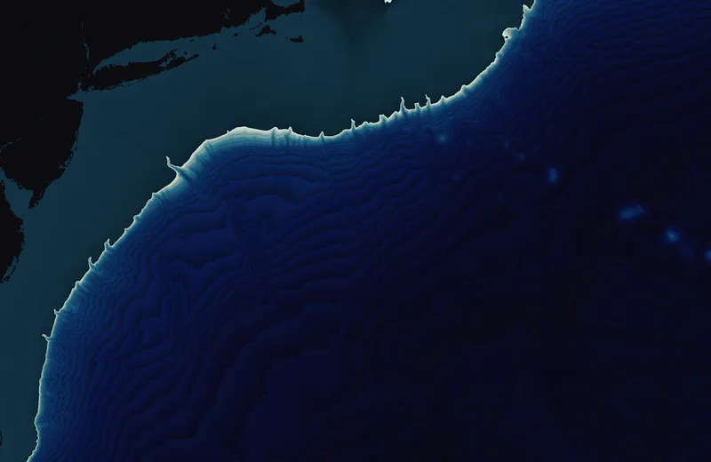
The sea floor off New York: the wide shelf, the edge where it drops away, the Hudson Canyon cutting through it, and the New England Seamounts.

This version: Depth bands.

Data: Terrain tiles on AWS (terrarium)

Download 3024 × 1964 · 5.4 MB
Monterey Canyon

Monterey Canyon

OLED

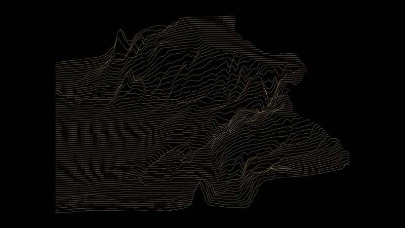
The canyon that starts at the beach in Monterey Bay and runs out to the deep Pacific.

This version: A ridgeline of depth profiles.

Data: Terrain tiles on AWS (terrarium)

Download 3840 × 2160 · 1.2 MB
Monterey Canyon

Monterey Canyon

Mini-LED

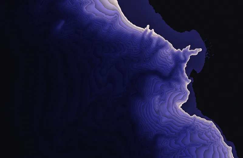
The canyon that starts at the beach in Monterey Bay and runs out to the deep Pacific.

This version: Depth bands.

Data: Terrain tiles on AWS (terrarium)

Download 3024 × 1964 · 5.9 MB
Mariana Trench

Mariana Trench

OLED

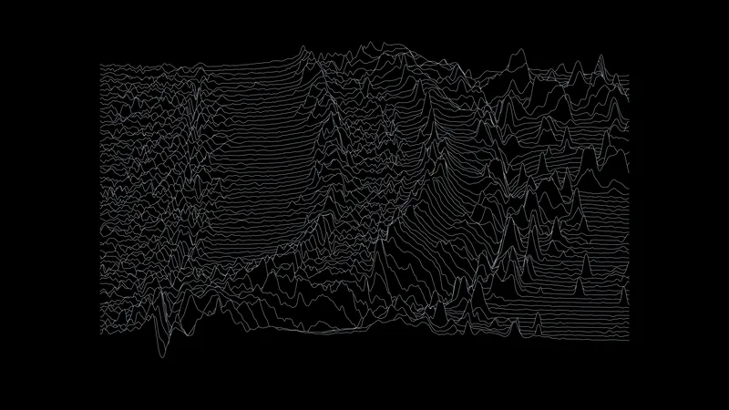
The deepest trench on Earth and the arc of islands and volcanoes beside it.

This version: A ridgeline of depth profiles.

Data: Terrain tiles on AWS (terrarium)

Download 3840 × 2160 · 1.5 MB
Mariana Trench

Mariana Trench

Mini-LED

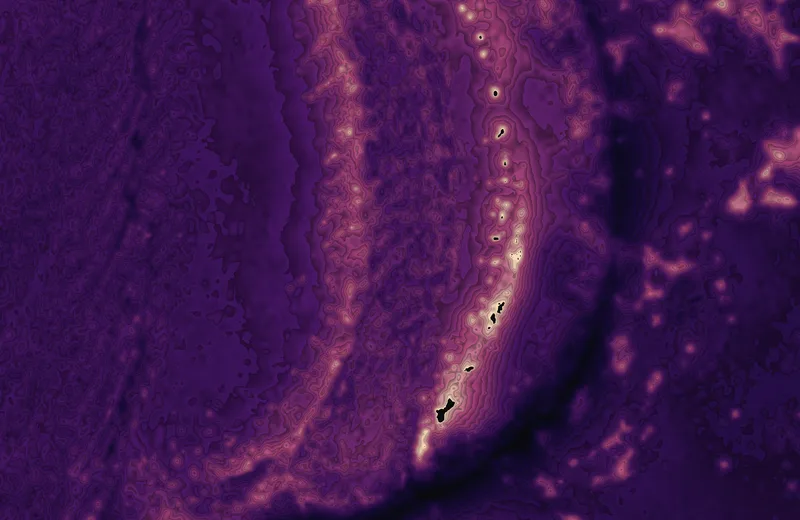
The deepest trench on Earth and the arc of islands and volcanoes beside it.

This version: Depth bands.

Data: Terrain tiles on AWS (terrarium)

Download 3024 × 1964 · 9.4 MB
Mid-Atlantic Ridge

Mid-Atlantic Ridge

OLED

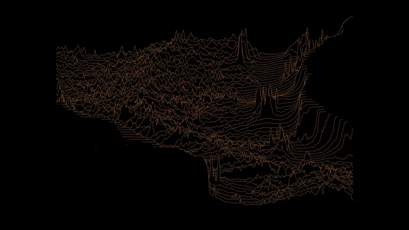
The central Atlantic, where the sea floor spreads apart. The ridge runs down the middle and the fracture zones cut across it.

This version: A ridgeline of depth profiles.

Data: Terrain tiles on AWS (terrarium)

Download 3840 × 2160 · 1.2 MB
Mid-Atlantic Ridge

Mid-Atlantic Ridge

Mini-LED

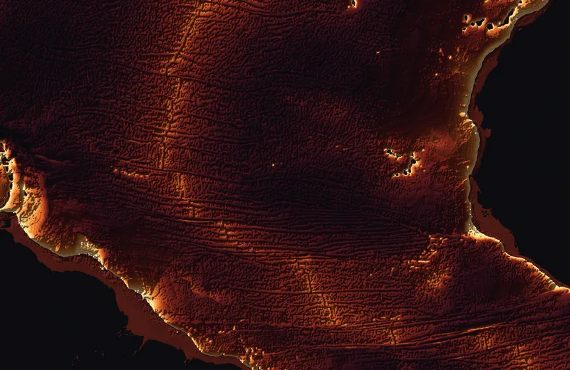
The central Atlantic, where the sea floor spreads apart. The ridge runs down the middle and the fracture zones cut across it.

This version: Depth bands with relief shading.

Data: Terrain tiles on AWS (terrarium)

Download 3024 × 1964 · 8.6 MB
Hawaiian–Emperor chain

Hawaiian–Emperor chain

OLED

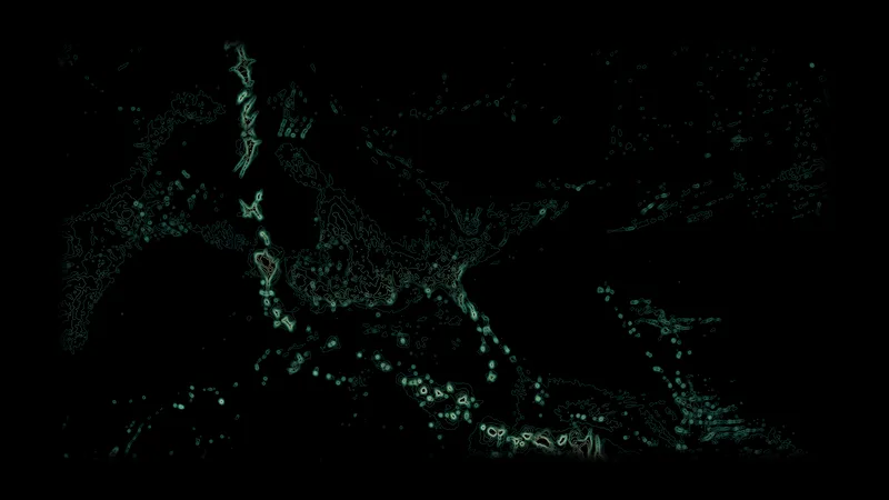
The line of drowned volcanoes that the Pacific plate has carried away from the Hawaiian hotspot, with the bend where the plate changed direction.

This version: Contour lines above 5,000 m depth.

Data: Terrain tiles on AWS (terrarium)

Download 3840 × 2160 · 1.3 MB
Hawaiian–Emperor chain

Hawaiian–Emperor chain

Mini-LED

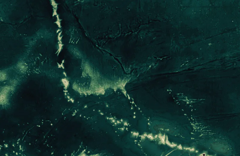
The line of drowned volcanoes that the Pacific plate has carried away from the Hawaiian hotspot, with the bend where the plate changed direction.

This version: Depth bands.

Data: Terrain tiles on AWS (terrarium)

Download 3024 × 1964 · 7.2 MB
Earth and air

Earthquakes, one hurricane, one island, city lights, and the Keeling curve.

Plate boundaries

Plate boundaries

OLED

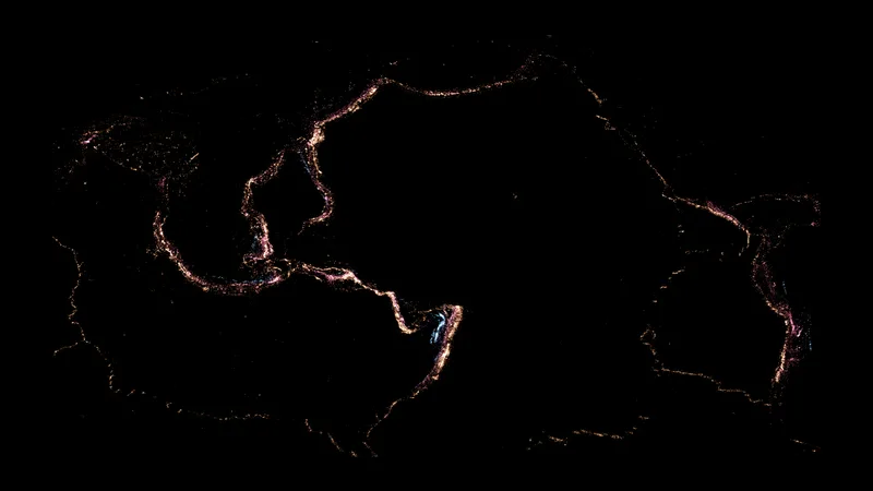
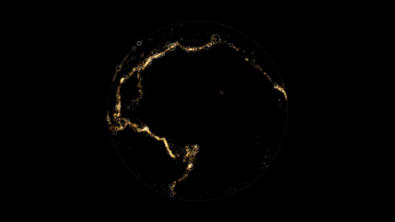
Every earthquake of magnitude 4.5 or more from 2000 to 2025, one point each. The color is the depth: amber near the surface, rose in between, blue for the deep ones. The points draw the edges of the plates.

Data: USGS earthquake catalog

Download 3840 × 2160 · 0.8 MB
A century of big ones

A century of big ones

OLED

Earthquakes of magnitude 6.5 or more since 1900, as rings on a globe seen from above the Pacific. Magnitude 8 and above is white.

Data: USGS earthquake catalog

Download 3840 × 2160 · 0.6 MB
Tonga slab

Tonga slab

OLED

A slice through the Tonga subduction zone, 1973 to 2025: longitude across, depth down to 700 km. The earthquakes trace the Pacific plate as it dives into the mantle.

Data: USGS earthquake catalog

Download 3840 × 2160 · 0.9 MB
Tohoku aftershocks

Tohoku aftershocks

OLED

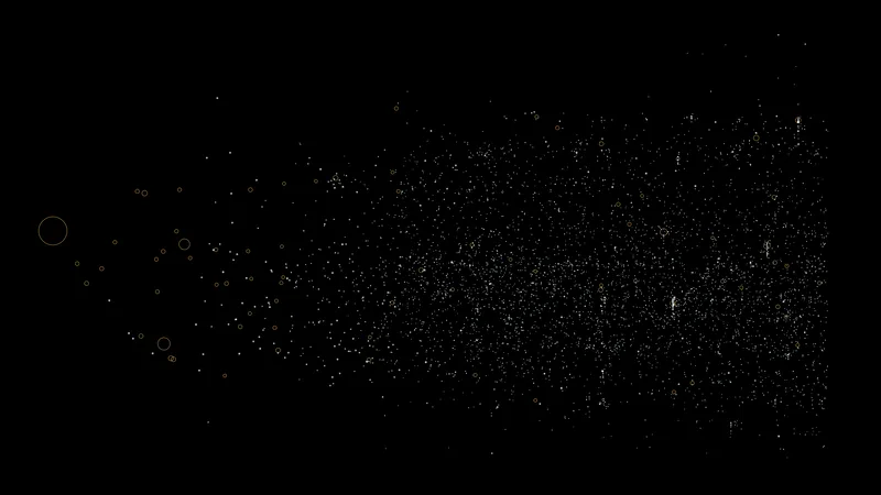
The aftershocks of the March 2011 Tohoku earthquake. Time runs on a logarithmic scale against latitude, and magnitude 6 and above gets a ring.

Data: USGS earthquake catalog

Download 3840 × 2160 · 0.3 MB
Earthquakes by year

Earthquakes by year

OLED

One line for each year from 1973 to 2025: the number of magnitude 5+ earthquakes at each longitude.

Data: USGS earthquake catalog

Download 3840 × 2160 · 1.2 MB
Hurricane Sandy

Hurricane Sandy

Mini-LED

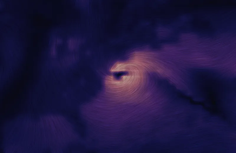
The wind over the western Atlantic at 18:00 UTC on October 29, 2012, a few hours before Sandy came ashore in New Jersey. The streaks follow the wind and the color is its speed. The dark spot in the bright spiral is the eye.

Data: ERA5 reanalysis through the Open-Meteo archive

Download 3024 × 1964 · 9.8 MB
Hawai‘i

Hawai‘i

Mini-LED

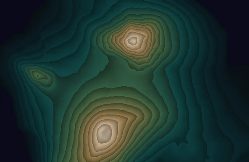
The island of Hawai‘i in bands of 300 m of elevation. Mauna Kea is at the top, Mauna Loa is at the bottom, and Hualālai is on the left.

Data: Terrain tiles on AWS (terrarium)

Download 3024 × 1964 · 5.7 MB
Washington to Boston

Washington to Boston

OLED

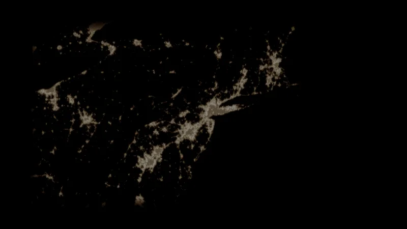
City lights at night as halftone dots: a bigger dot is a brighter place.

Data: NASA Black Marble 2016 through GIBS

Download 3840 × 2160 · 0.8 MB
Japan and Korea

Japan and Korea

OLED

City lights as a ridgeline: each line is one band of latitude, and its height is the brightness.

Data: NASA Black Marble 2016 through GIBS

Download 3840 × 2160 · 0.9 MB
India

India

OLED

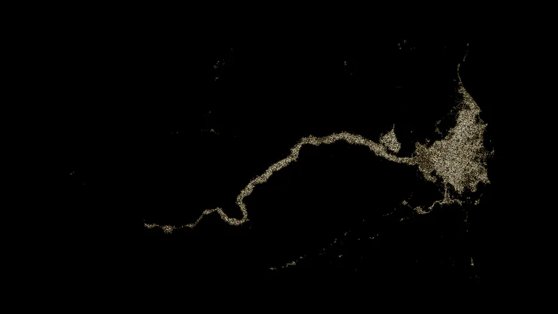
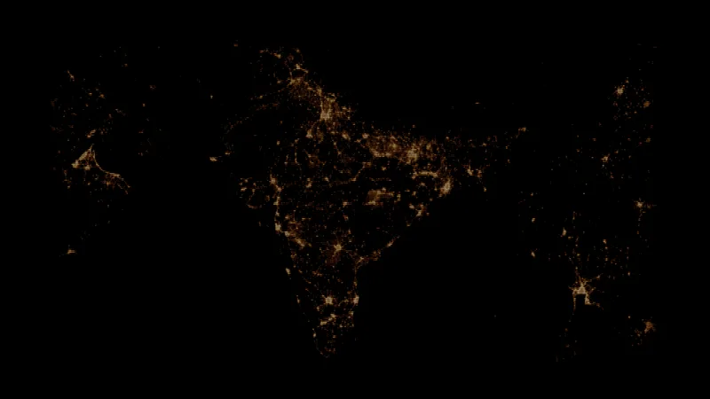
Horizontal scan lines that are drawn only where there is light, and thicker where it is brighter.

Data: NASA Black Marble 2016 through GIBS

Download 3840 × 2160 · 0.4 MB
CO₂ spiral

CO₂ spiral

OLED

Atmospheric CO₂ at Mauna Loa from 1958 to 2026. One turn is one year and the radius is the concentration, so the line never closes.

Data: NOAA Global Monitoring Laboratory, Mauna Loa

Download 3840 × 2160 · 1.5 MB
The planet breathing

The planet breathing

OLED

The seasonal cycle of CO₂ with the long rise removed, one line for each year from 1975 to 2025. Northern forests pull the level down every summer.

Data: NOAA Global Monitoring Laboratory, Mauna Loa

Download 3840 × 2160 · 0.8 MB
Keeling curve

Keeling curve

OLED

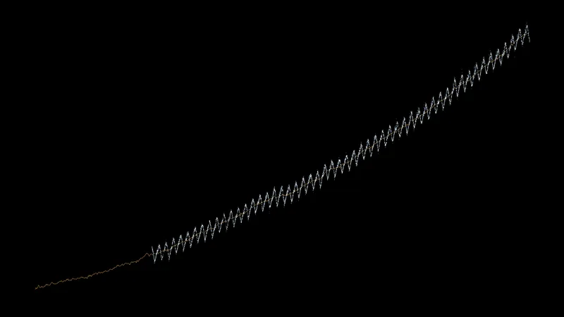
The plain record: daily measurements from 1974 as points and the trend from 1958 as an amber line.

Data: NOAA Global Monitoring Laboratory, Mauna Loa

Download 3840 × 2160 · 0.3 MB
CO₂ coil

CO₂ coil

OLED

The CO₂ level against how fast it is changing. Each year is one loop, and the loops march sideways as the level rises.

Data: NOAA Global Monitoring Laboratory, Mauna Loa

Download 3840 × 2160 · 1.7 MB
CO₂ bands

CO₂ bands

OLED

The year against the time of year, as a contour map of the CO₂ level.

This version: Contour lines every 2 ppm.

Data: NOAA Global Monitoring Laboratory, Mauna Loa

Download 3840 × 2160 · 1.1 MB
CO₂ bands

CO₂ bands

Mini-LED

The year against the time of year, as a contour map of the CO₂ level.

This version: Filled bands of 4 ppm.

Data: NOAA Global Monitoring Laboratory, Mauna Loa

Download 3024 × 1964 · 7.8 MB

Space

A pulsar, the planets, the stars, the sun's spots, and two black holes.

CP 1919

CP 1919

OLED

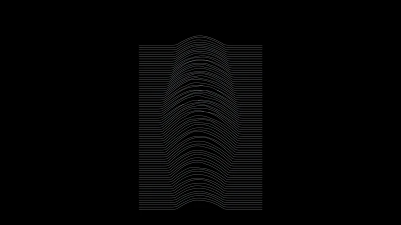
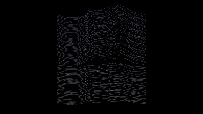
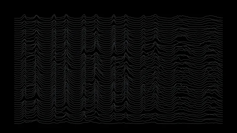
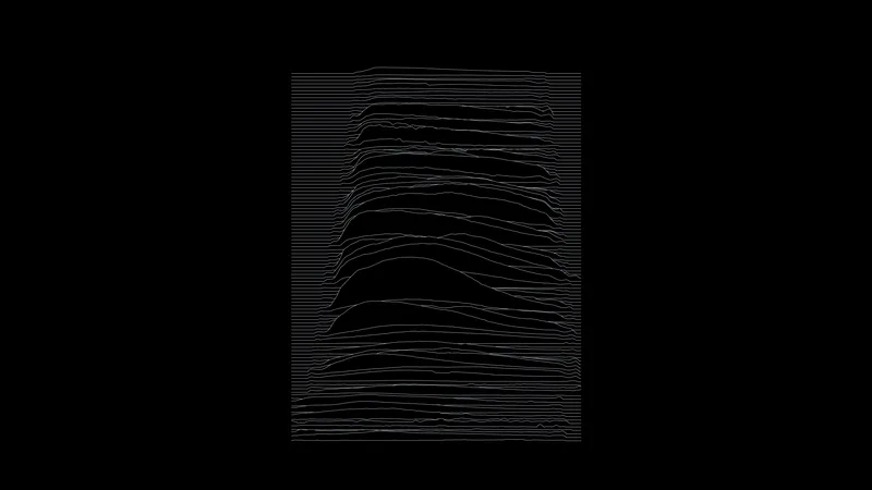
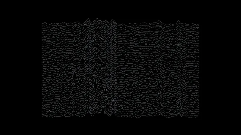
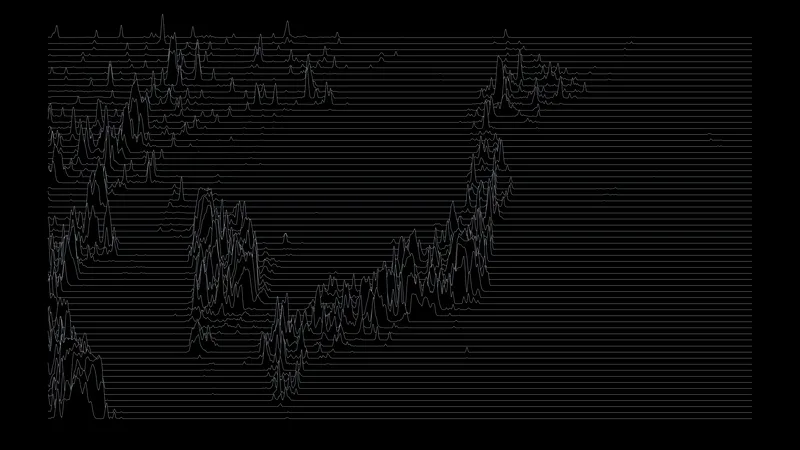
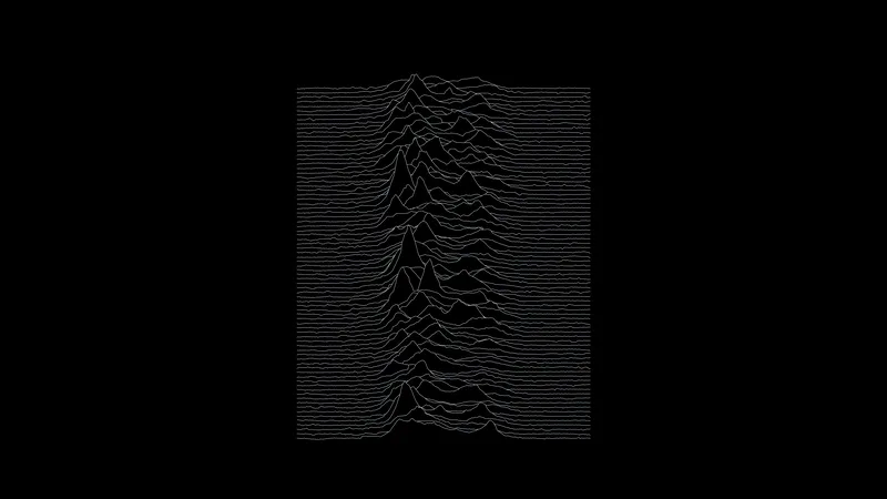
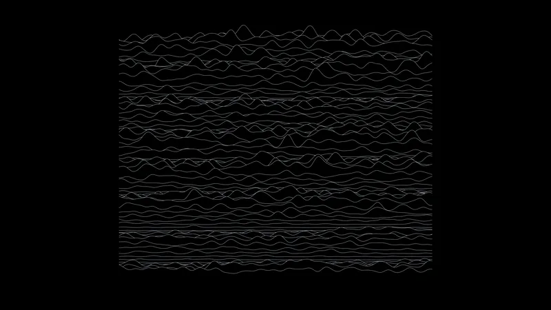
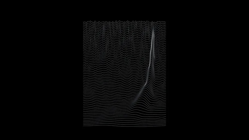
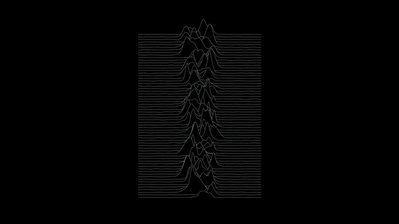
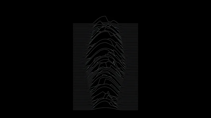
80 successive radio pulses from the first pulsar ever found, stacked so that each hides the ones behind it. This is the chart on the cover of Joy Division's Unknown Pleasures.

Data: Harold Craft's 1970 thesis plot, digitized

Download 3840 × 2160 · 0.7 MB
CP 1919, sorted

CP 1919, sorted

OLED

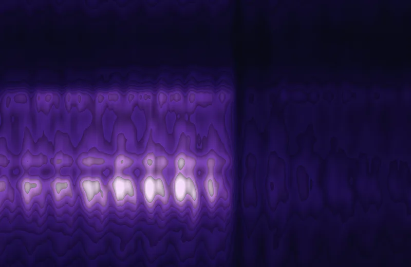
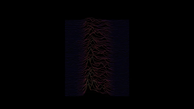
The same 80 pulses in order of total energy, with the color running from violet to orange with intensity.

Data: Harold Craft's 1970 thesis plot, digitized

Download 3840 × 2160 · 0.8 MB
CP 1919, rings

CP 1919, rings

OLED

40 of the pulses bent into rings. Each ring hides the rings outside it.

Data: Harold Craft's 1970 thesis plot, digitized

Download 3840 × 2160 · 1.1 MB
CP 1919, contours

CP 1919, contours

OLED

The middle of the pulse stack read as terrain: pulse number against time within the pulse, with contours of intensity.

This version: Contour lines.

Data: Harold Craft's 1970 thesis plot, digitized

Download 3840 × 2160 · 0.7 MB
CP 1919, contours

CP 1919, contours

Mini-LED

The middle of the pulse stack read as terrain: pulse number against time within the pulse, with contours of intensity.

This version: Filled bands.

Data: Harold Craft's 1970 thesis plot, digitized

Download 3024 × 1964 · 5.0 MB
Earth to Venus

Earth to Venus

OLED

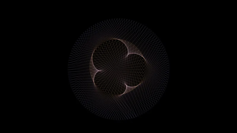
A line from Earth to Venus every few days for eight years, 2020 to 2028. In that time Earth goes around the sun 8 times and Venus 13 times, and the lines draw five petals.

Data: NASA JPL Horizons

Download 3840 × 2160 · 1.6 MB
Jupiter to Saturn

Jupiter to Saturn

OLED

A line from Jupiter to Saturn at steady intervals from 1960 to 2020. The two planets line up every 20 years, which makes three cusps.

Data: NASA JPL Horizons

Download 3840 × 2160 · 1.4 MB
Mars from Earth

Mars from Earth

OLED

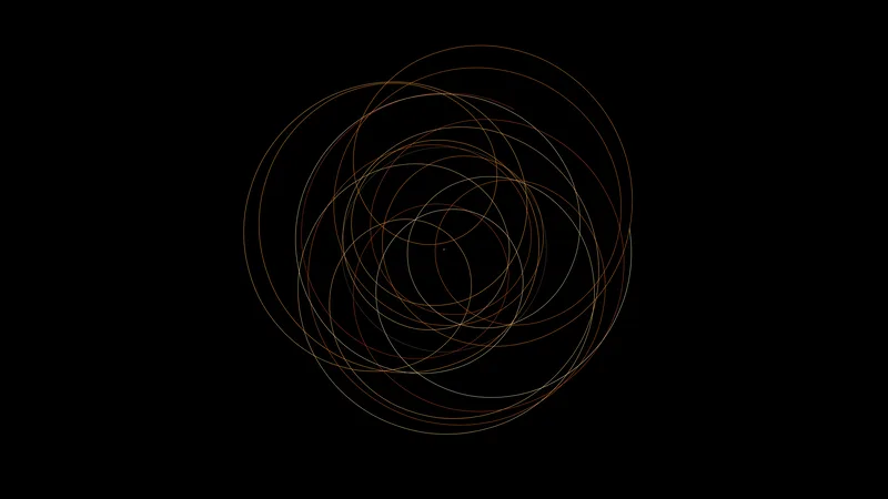
Where Mars is relative to Earth from 2010 to 2042. Every time Earth overtakes it, Mars appears to back up and makes a loop: 15 of them here.

Data: NASA JPL Horizons

Download 3840 × 2160 · 0.7 MB
The sun's wobble

The sun's wobble

OLED

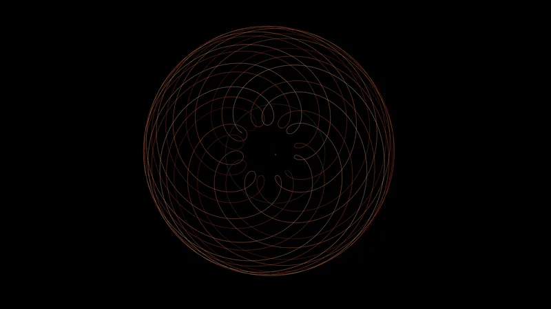
The sun does not sit still. This is its path around the center of mass of the solar system from 1900 to 2100, pulled mostly by Jupiter and Saturn. The circle is the size of the sun itself.

Data: NASA JPL Horizons

Download 3840 × 2160 · 0.5 MB
Jupiter's moons

Jupiter's moons

OLED

The four large moons of Jupiter swinging from one side of the planet to the other, as they would look through a small telescope night after night from January 1, 2026.

Data: NASA JPL Horizons

Download 3840 × 2160 · 0.5 MB
The sky over New York

The sky over New York

OLED

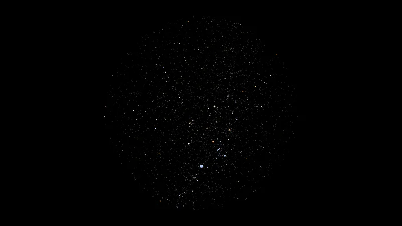
Every star you could see with the naked eye from New York at midnight on January 1, 2026, with the zenith in the center. Orion and Sirius are in the south.

Data: HYG star database v4.1

Download 3840 × 2160 · 0.2 MB
The whole sky

The whole sky

OLED

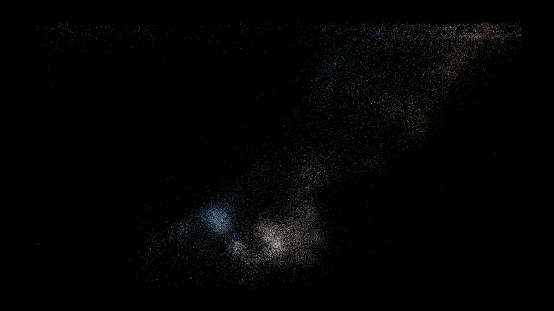
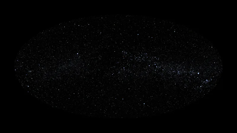
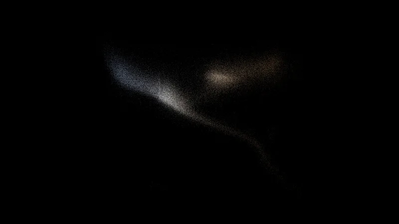
The whole catalog on a map of the entire sky, with the plane of the galaxy along the middle. The hot blue stars are drawn larger, because they are what makes the band of the Milky Way visible.

Data: HYG star database v4.1

Download 3840 × 2160 · 1.4 MB
The neighbors

The neighbors

OLED

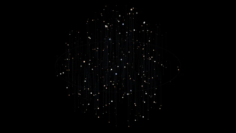
The 521 stars within 12 parsecs of the sun, in three dimensions. Each star has a line dropping to the plane of the galaxy, which shows how far above or below it sits.

Data: HYG star database v4.1

Download 3840 × 2160 · 0.2 MB
Hertzsprung–Russell diagram

Hertzsprung–Russell diagram

OLED

One point for each star: its color across and its true brightness up. Most stars fall on one diagonal, the main sequence, and the giants branch off above it.

Data: HYG star database v4.1

Download 3840 × 2160 · 0.9 MB
Sunspots by year

Sunspots by year

OLED

The daily sunspot number, one line for each year from 1945 to 2025. Quiet years are flat and active years are rough.

Data: SILSO, Royal Observatory of Belgium

Download 3840 × 2160 · 0.9 MB
25 cycles

25 cycles

OLED

All 25 numbered solar cycles laid over each other, each starting at its minimum. The current cycle is white.

Data: SILSO, Royal Observatory of Belgium

Download 3840 × 2160 · 1.1 MB
Sunspot spiral

Sunspot spiral

OLED

The monthly sunspot number since 1749. One turn is 11 years and the area of each dot is the number, so active years line up on one side.

Data: SILSO, Royal Observatory of Belgium

Download 3840 × 2160 · 0.6 MB
North and south

North and south

OLED

Daily sunspot numbers for the sun's northern and southern hemispheres from 1992 to 2026, mirrored. The two halves do not peak together.

Data: SILSO, Royal Observatory of Belgium

Download 3840 × 2160 · 0.5 MB
Sunspot contours

Sunspot contours

OLED

Cycles 1 to 24 as a contour map: the time within the cycle against the cycle number.

This version: Contour lines.

Data: SILSO, Royal Observatory of Belgium

Download 3840 × 2160 · 0.7 MB
Sunspot contours

Sunspot contours

Mini-LED

Cycles 1 to 24 as a contour map: the time within the cycle against the cycle number.

This version: Filled bands.

Data: SILSO, Royal Observatory of Belgium

Download 3024 × 1964 · 5.5 MB
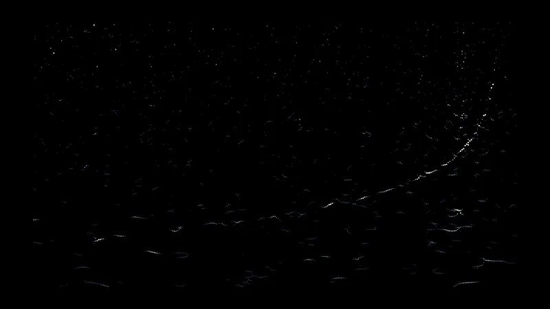
GW150914

GW150914

OLED

The first gravitational wave ever detected: two black holes spiraling together, 1.3 billion light years away. Time runs across and frequency runs up. The signal sweeps upward as the holes speed up, then stops when they merge.

This version: A ridgeline with one line for each frequency.

Data: Gravitational Wave Open Science Center

Download 3840 × 2160 · 0.8 MB
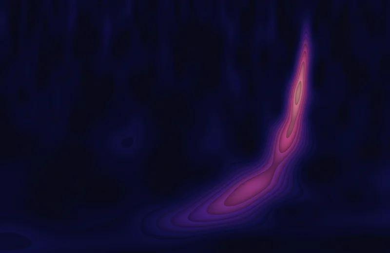
GW150914

GW150914

Mini-LED

The first gravitational wave ever detected: two black holes spiraling together, 1.3 billion light years away. Time runs across and frequency runs up. The signal sweeps upward as the holes speed up, then stops when they merge.

This version: Filled contour bands.

Data: Gravitational Wave Open Science Center

Download 3024 × 1964 · 4.9 MB
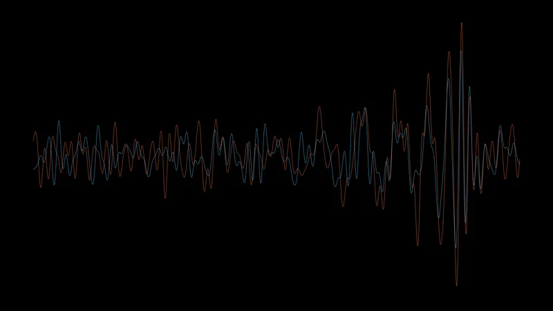
Two detectors

Two detectors

OLED

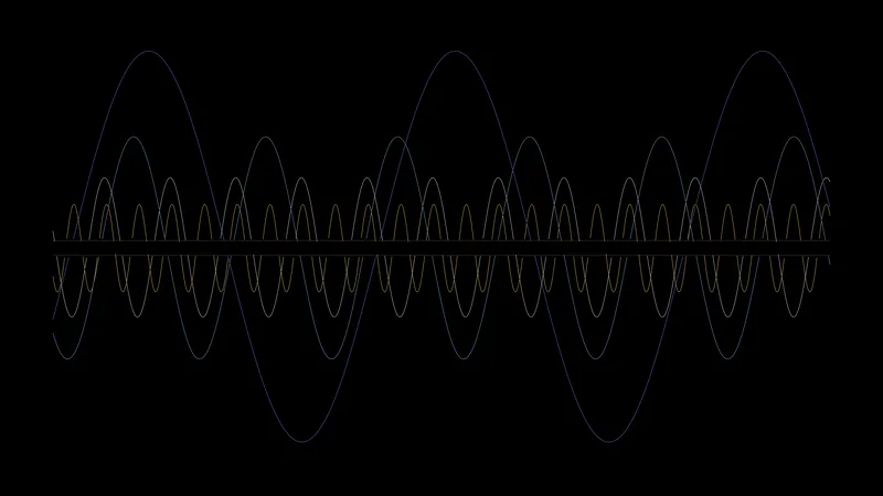
The same event as a waveform, from the detector in Hanford (orange) and the one in Livingston (blue). They agree, 7 milliseconds apart.

Data: Gravitational Wave Open Science Center

Download 3840 × 2160 · 0.5 MB
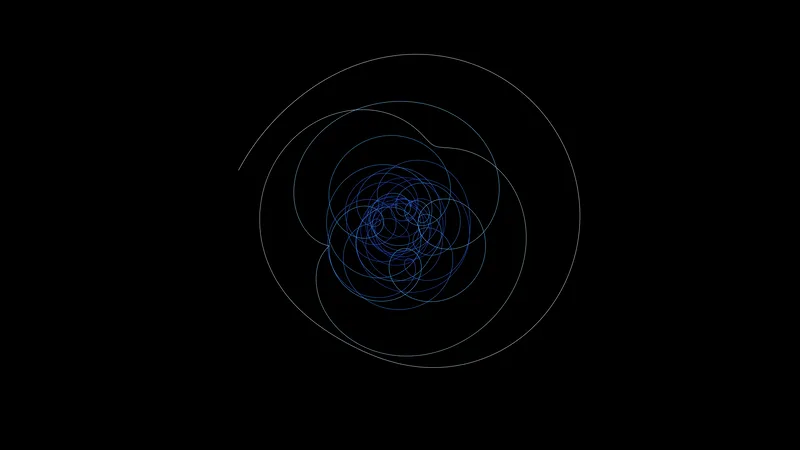
GW200129

GW200129

OLED

A later black hole merger. The signal is plotted against a copy of itself shifted by a quarter of a cycle, which turns the growing wave into a spiral.

Data: Gravitational Wave Open Science Center

Download 3840 × 2160 · 0.3 MB
GW170817

GW170817

OLED

Two neutron stars merging. They are much lighter than black holes, so the signal stays in the detector's range for many seconds; the points trace 14.8 of them.

Data: Gravitational Wave Open Science Center

Download 3840 × 2160 · 0.1 MB
GW190814

GW190814

OLED

A merger of very unequal partners: a 23 solar mass black hole and something of 2.6 solar masses, which makes a long, slow chirp.

This version: Contour lines.

Data: Gravitational Wave Open Science Center

Download 3840 × 2160 · 0.5 MB
GW190814

GW190814

Mini-LED

A merger of very unequal partners: a 23 solar mass black hole and something of 2.6 solar masses, which makes a long, slow chirp.

This version: Filled contour bands.

Data: Gravitational Wave Open Science Center

Download 3024 × 1964 · 3.6 MB

Mathematics

Where this started, before any real data: numbers, attractors, and noise.

Clifford attractor

Clifford attractor

OLED

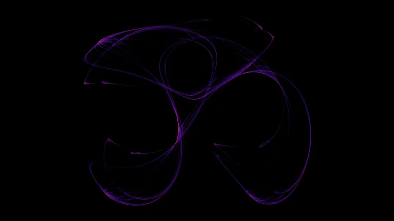
One point is moved by the same pair of equations tens of millions of times, and every pixel counts how often it was visited. The orbit never repeats, but it stays on this shape.

Data: Computed

Download 3840 × 2160 · 1.0 MB
Collatz tree

Collatz tree

OLED

Take a number; halve it if it is even, otherwise triple it and add one; repeat until you reach 1. This is every path for the numbers 1 to 8,000, drawn outward from 1, turning one way at even steps and the other at odd ones. Thicker branches carry more numbers.

Data: Computed

Download 3840 × 2160 · 1.4 MB
Sacks spiral

Sacks spiral

OLED

The whole numbers on a spiral, with only the primes drawn. They fall along curves that nobody has fully explained. Twin primes are amber.

Data: Computed

Download 3840 × 2160 · 0.5 MB
Ridgeline

Ridgeline

OLED

A made-up pulsar: 64 random pulses stacked the way the CP 1919 chart is. This was the test for the real one.

Data: Random, seeded

Download 3840 × 2160 · 0.5 MB
Streamlines

Streamlines

OLED

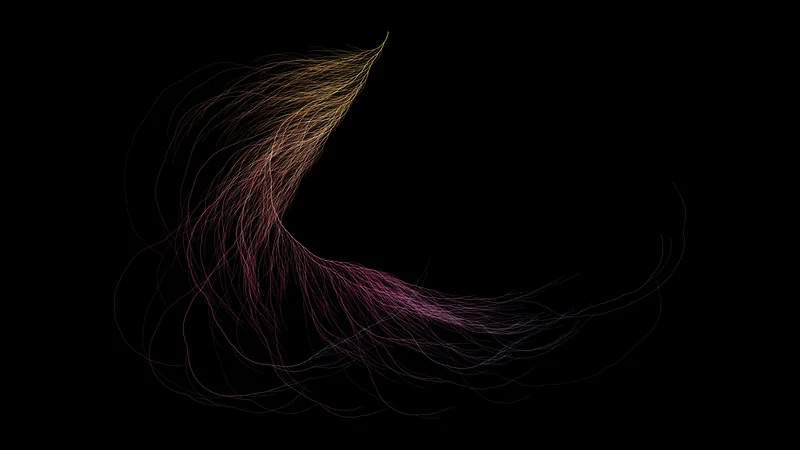
Lines that follow an invented flow. The flow has no sources or sinks, so the lines never crowd together. The color is the speed.

Data: Curl noise, seeded

Download 3840 × 2160 · 1.6 MB
Clifford attractor, in color

Clifford attractor, in color

Mini-LED

The same attractor at a scale larger than the screen, with a glow behind the filaments.

Data: Computed

Download 3024 × 1964 · 7.2 MB
Ripple

Ripple

Mini-LED

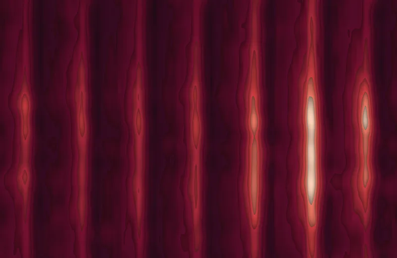
Wavefronts spreading from two points just off opposite corners of the screen. Where both are high the colors add.

Data: Computed

Download 3024 × 1964 · 6.6 MB